Main
Veronte Panel
This pannel is the basic operator tool. It includes all basic commands (phase and action buttons) and information needed during a standard mission. These commands can be triggered with a single click, by sliding and/or automatically.
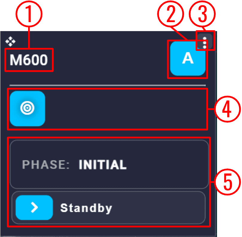
Veronte Panel
Platform name: The name of the selected platform is shown here.
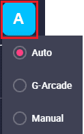
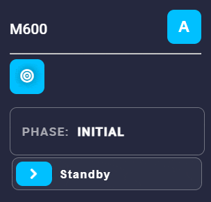
Flight mode: Displays the currently selected flight mode in which the user is operating.
By clicking on it, it is possible to manually change the selected mode. The flight modes available here must be previously defined in the Modes section of the 1x PDI Builder software.
Veronte Panel - Flight modes
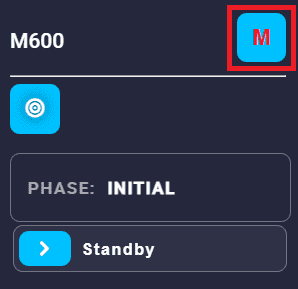
Note
When in manual mode, the lettering of the icon will be red, to warn the operator to be careful in this mode.
Veronte Panel - Manual flight mode
Besides, the mode can also be changed automatically with an automation or manually with a configured stick. The following example shows the mode change with a stick:
Veronte Panel - Changing flight modes with a stick
Options:
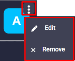
Veronte Panel options
Remove: Deletes this widget.
Edit: This allows the user to access the Veronte panel configuration menu.
This widget has only one extra edit parameter compared to the ones described in Widget common configuration:
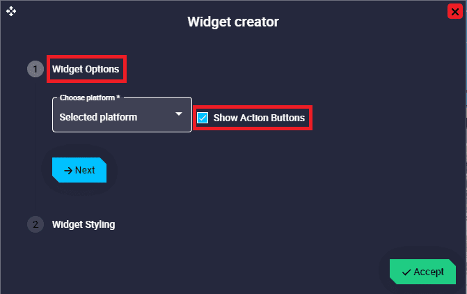
Veronte Panel configuration
Widget Options \(\rightarrow\) Show Action Buttons: When enabled, the action buttons are displayed in the Veronte panel.
Action buttons: Action buttons can be used to manually trigger certain actions. These buttons must have been previously defined in the Automations menu of the 1x PDI Builder software.
These buttons change to green when clicked.
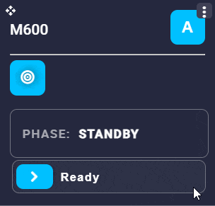
Veronte Panel - Changing phase
Phase buttons: The currently selected phase is always displayed at the top in the current phase identifier.
Important
Not all existing flight phases are initially displayed. Only flight phases that can be entered from the currently selected phase are displayed.
To change phase, simply slide the
 icon to the right. Then, if everything is correct, the phase will be displayed in the current phase indentifier and will be colored green while switching to that phase. An example is shown below:
Veronte Panel - Changing phase
Warning
An error may occur when changing phase, so that the phase change does not take place.
To solve this problem, please check the Error when changing phase - Troubleshooting section of this manual.
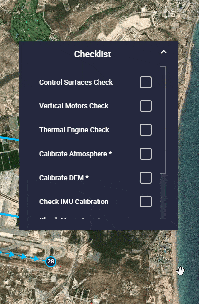
Checklist
This panel is used to make sure that some requirements have been accomplished, for example, prior to a phase change or to avoid a possible malfunction.
It must be previously defined in the Checklist section of the 1x PDI Builder software.

Checklist
Options:
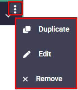
Checklist options
Duplicate: Duplicates this widget.
Edit: This allows the user to access the Checklist configuration menu. This widget has only the ‘basic’ configuration described in the Widget common configuration.
Remove: Deletes this widget.
As this widget behaves like a drop-down menu, clicking on the  icon will display all checklists:
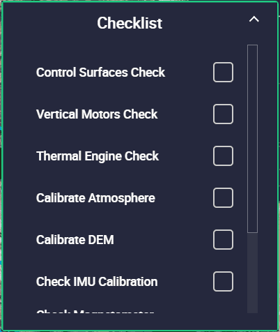
Checklist deployed
Besides, as can be seen in the figures above, the checklist widget has a small green border. This indicates that everything is OK to start the operation, even though there is no ‘check’ in the list.
This is because none of these checks are mandatory to switch phases or start the operation. The mandatory checks are marked with an asterisk (*) on the right, as shown in the image below.
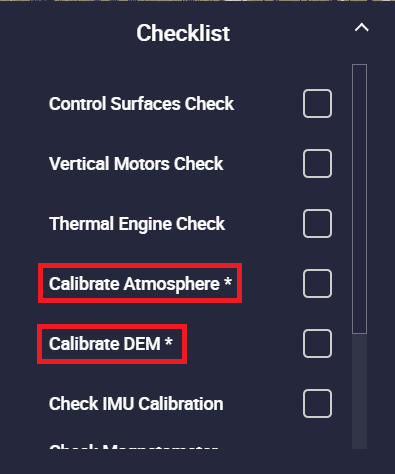
Checklist deployed - Not checked
In this case, the widget has no green border until these mandatory actions are performed:
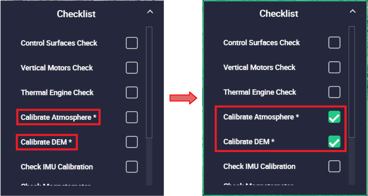
Checklist deployed - Checked
To do so, checking them opens a menu that allows the user to perform these actions, in this case, some calibrations. An example is shown below:
Checklist - Actions
Map
This widget corresponds to the map and only appears in this menu when the map has been hidden by the user.