Charts
Chart
Charts widgets allow the user to represent any variable of the system with respect to time. Thus, the user can visualize the evolution of that variable over time.
It is very useful during flight tests (gain tuning) and operations to monitor the behaviour of the platform.
Chart
Right click on the chart to access its options (Duplicate, Edit and Remove).
Options \(\rightarrow\) Edit: This allows the user to access the Chart configuration menu.
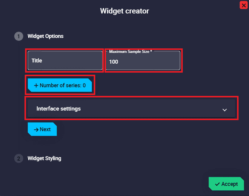
Chart configuration
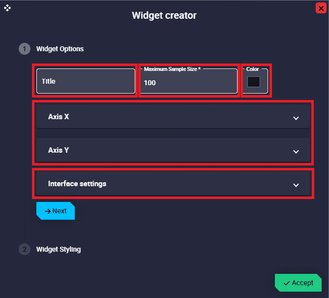
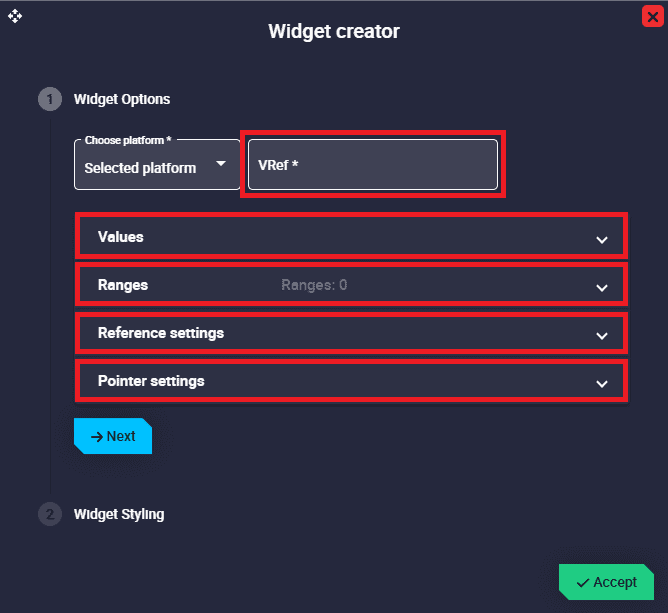
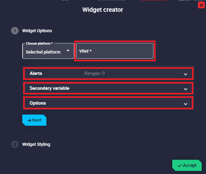
Widget Options
This widget has extra edit parameters compared to the ones described in the Widget common configuration.
Title: Title of the chart.
Maximum Sample Size: Maximum number of samples of the selected variable drawn in the chart. By default it is set to 100.
Number of series: Number of variables drawn in the chart. Users can add as many series as they wish to represent in the same chart.
The appearance of this series in the chart can be configured below:
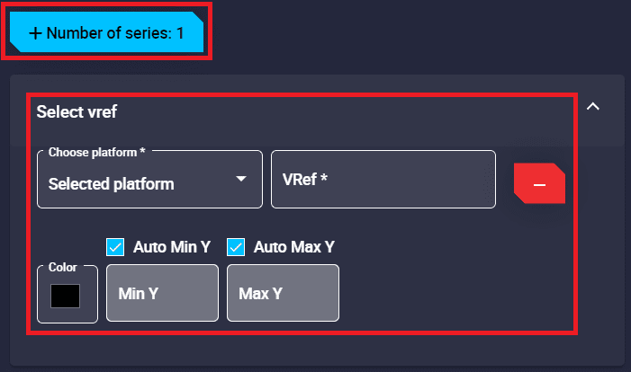
Chart configuration - Series
VRef: Users can choose any real, integer or bit variable to be displayed on the chart.
Unit Y and Decimals: Attention!! These are only available with Real variables.
Color: This is the color in which the line with the values of the series is drawn. By default, the first series is drawn in blue, the second in green, the third in yello, the fourth in red, etc.
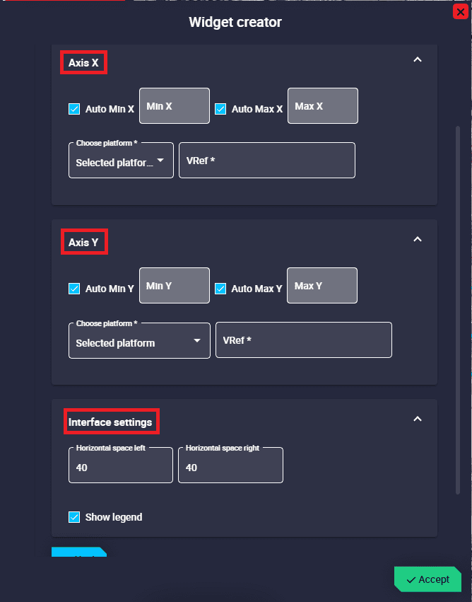
Auto Min/Max Y: If enabled, minimum and maximum of the Y axis of the chart are automatically adjusted.
Min/Max Y: Minimum and maximum Y axis of the chart can be adjusted manually.
Interface settings:
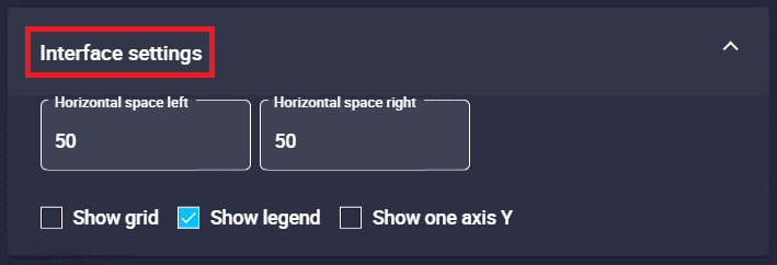
Chart configuration - Interface settings
Horizontal space left/right: The horizontal space left/right of the chart background can be customized. By default they are set to 50.
Show grid: The grid of the chart can be shown/hidden.
Show legend: The legend of the series can be shown/hidden on the chart.
Show one axis Y: When more than one series is added, it is possible to show only one Y axis by enabling this option.
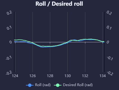
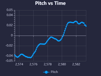
The following is an example of a typical chart used during operation:
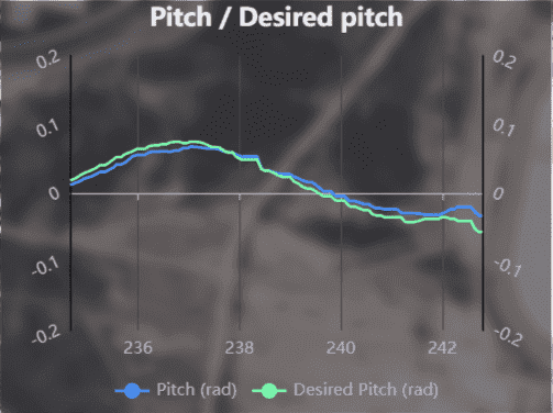
Chart example
The custom configuration made for this chart is as follows:
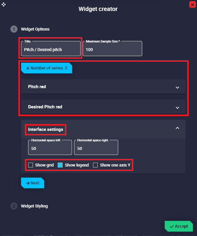
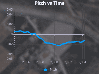
Chart configuration - Widget Options example
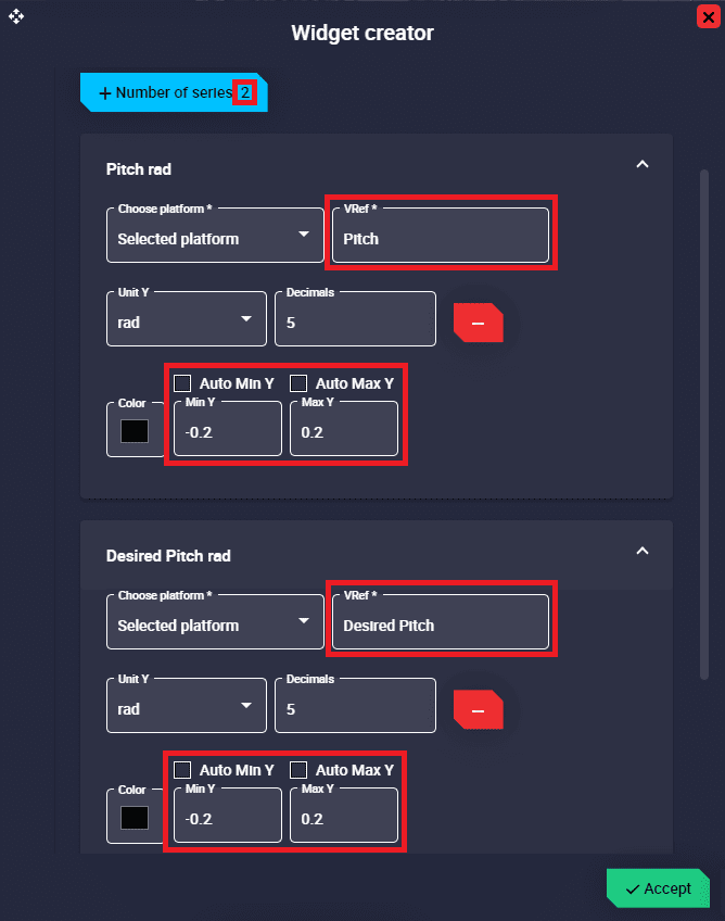
Chart configuration - Series example
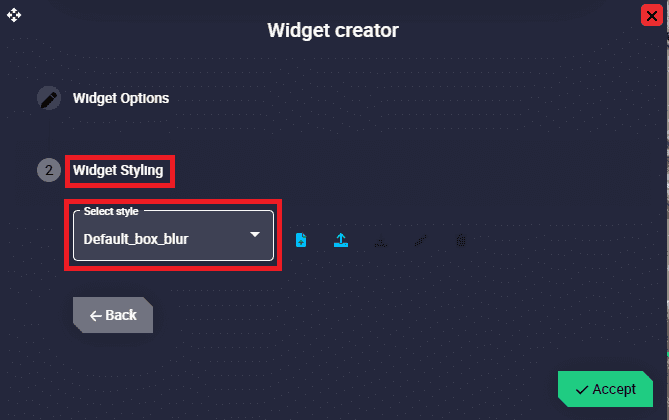
Chart configuration - Widget Styling example
Scatter
Scatter widget allows the user to represent any variable in the system with respect to another variable.
Scatter
Right click on the scatter to access its options (Duplicate, Edit and Remove).
Options \(\rightarrow\) Edit: This allows the user to access the Scatter configuration menu.
Scatter configuration
Widget Options
This widget has extra edit parameters compared to the ones described in the Widget common configuration.
Title: Title of the scatter.
Maximum Sample Size: Maximum number of samples of the selected variables that are drawn in the scatter. By default it is set to 100.
Color: This is the color in which the values are drawn.
Scatter configuration
Axis X/Y: The user must select the variables to be plotted on both axes. The appearance of the variables in the scatter can then be modified:
Auto Min/Max X/Y: If enabled, the minimum and maximum of the X/Y axes of the scatter are automatically adjusted.
Min/Max X/Y: The minimum and maximum X/Y axes of the scatter can be adjusted manually.
VRef: Users can choose any real, integer or bit variables to be displayed in the scatter.
Unit and Decimals: Attention!! These are only available with Real variables.
Interface settings:
Horizontal space left/right: The left/right horizontal spacing of the scatter background can be customized. By default they are set to 40.
Show legend: The legend of the variable on the Y axis can be shown/hidden in the scatter.
An example is given below:
Scatter example
The custom configuration made for this scatter is as follows:
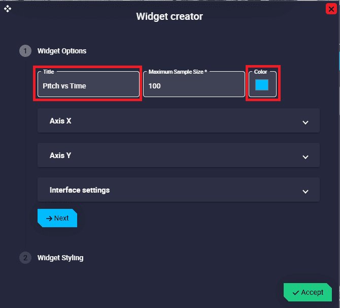
Scatter configuration - Widget Options example
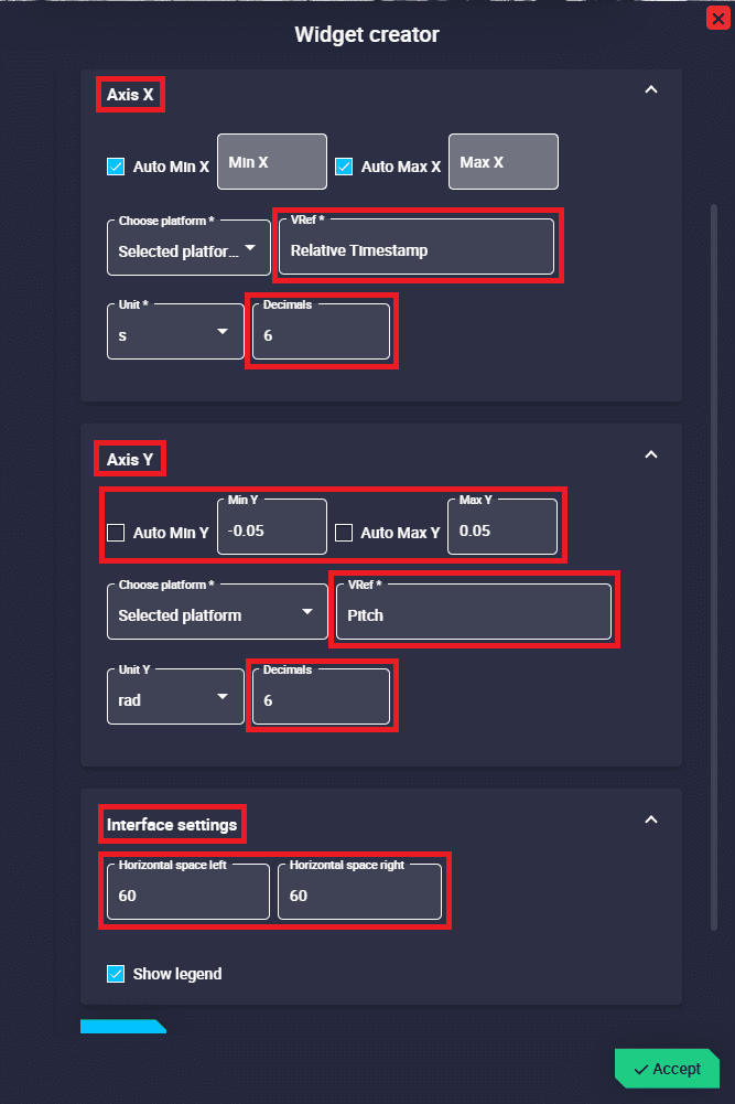
Scatter configuration - Widget Options example
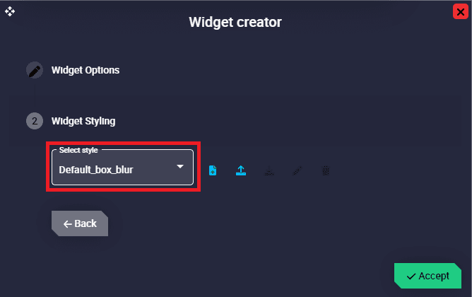
Scatter configuration - Widget Styling example
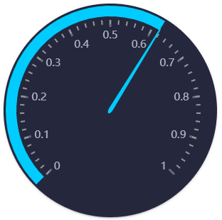
Gauge
Gauge widget is a data visualisation tool that can be used to show the progress of data or display data in ranges in a precise and compact area.
This allows to display the progress of measuremetns in a circular arc or to see these numerical values in a range of colors that can have a certain meaning for the user.
Gauge
Right click on the gauge to access its options (Duplicate, Edit and Remove).
Options \(\rightarrow\) Edit: This allows the user to access the Gauge configuration menu.
Gauge configuration
Widget Options
This widget has extra edit parameters compared to the ones described in the Widget common configuration.
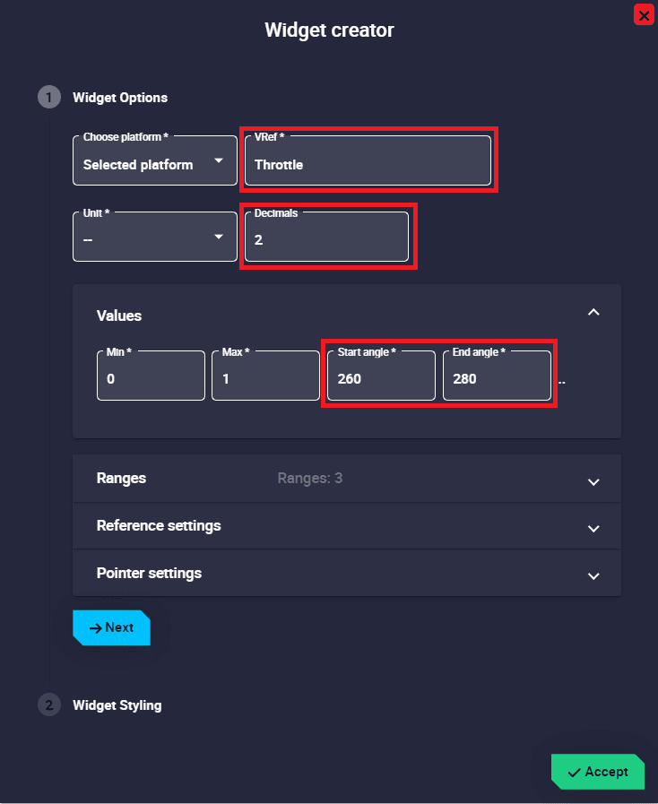
VRef: Users can choose any real, integer or bit variable to be displayed on the gauge.
Unit and Decimals: Attention!! These are only available with Real variables.
Values:
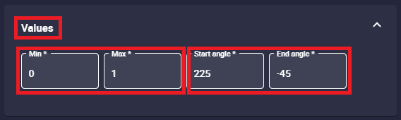
Gauge configuration - Values
Min/Max: Minimum and maximum values displayed on the gauge.
Start/End angle: Start and end angle of the position of the minimum and maximum values respectively.
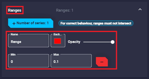
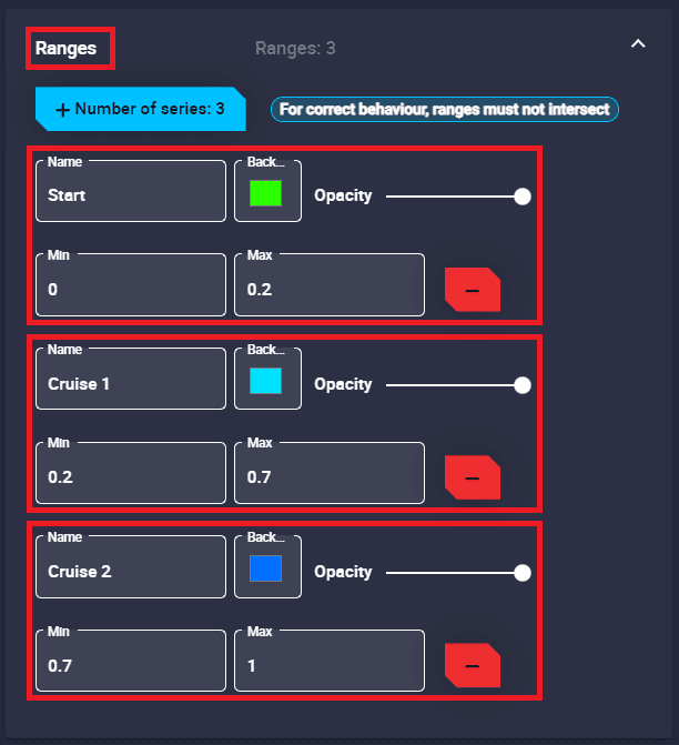
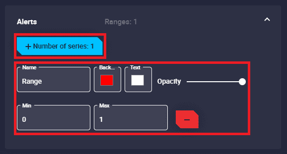
Ranges: Allows the user to set different ranges.
Warning
The panel warns the user that for correct behaviour, ranges must not intersect.
Several customizations can be made in the different ranges:
Gauge configuration - Ranges
Name: An identifying name for the range can be set.
Background color: Sets the color of the gauge arc in this range.
Opacity: The opacity of the circular arc can be customized in this range.
Min/Max: Defines the minimum and maximum values of the range.
Remove: Click to delete this range.
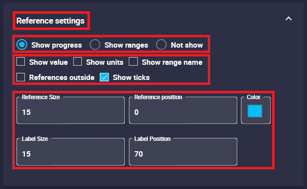
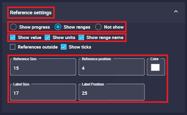
Reference settings:
Gauge configuration - Reference settings
The gauge can be configured to display the progress of the values on the arc, to be displayed with color ranges according to the values or only with a needle indicating the value of the selected variable:
Show Progress: Shows the progress arc of the selected variable in the gauge.
Show Ranges: Displays the gauge with the previously defined ranges.
Not Show: The needle indicates the value but neither the progress nor the ranges are shown in the gauge.
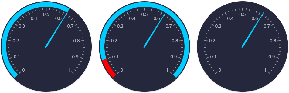
Reference settings - ‘Show Progress/Ranges’ and ‘Not Show’ respectively
Reminder
Only one of the three options described below can be selected.
In addition, this widget is highly customizable so that users can configure it to their wishes:
Show Value: If enabled, displays on the gauge the value of the selected variable that the needle is pointing to.
Show Units: If enabled, displays the units of the value of the selected variable that the needle is pointing to.
Show range name: If enabled, it displays, next to the value, the name of the range (previously defined) in which the value is in.
In addition, the color of this text will be the same as that of its corresponding range.
References Outside: References refers to the displayed axis and its numbering.
By default, the arc axis numbering is “inside” the arc, by enabling it, it will be in the “outside” part.
Show Ticks: Axis ticks can be shown/hidden. By default it is enabled, i.e. they are shown.
Reference Size: The size of the axis numbering can be modified.
Reference position: The position of the axis numbering can be adjusted by the user.
The default position is 0.
Label Size: The size of the text value can be modified.
Label Position: The position of the value can be adjusted.
The default position is at 70, at the bottom of the gauge. If set to 0, the label will be in the center of the gauge.
Color: This is the color in which the value is drawn.
Note
When ‘Show Ranges’ option is selected, the color of the value is not this selected color, but is colored according to the color of range the value is in.
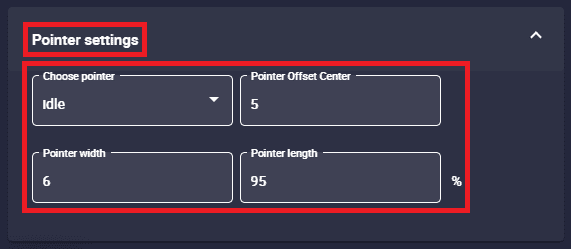
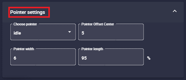
Pointer settings: Here the user can configure the pointer of the gauge.
Gauge configuration - Pointer settings
Choose pointer: Users can choose a desired pointer from the list. If none is selected, no pointer will be drawn.
Pointer Offset Center: Position of the “start” of the needle with respect to the center of the gauge. Default is set to 5.
Poiter width: Width of the pointer. The default width is 6.
Pointer length: Pointer length is set as a percentage of the distance between the centet and the edge of the gauge.
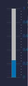
An example is given below:
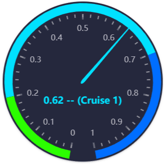
Gauge example
The custom configuration made for this gauge is as follows:
Gauge configuration - Values example
Gauge configuration - Ranges example
Gauge configuration - Reference settings example
Gauge configuration - Pointer settings example
Bar
Bar widget graphically displays the value of a selected variable by means of a bar. In addition, color ranges can be specified according to specific values.
The appearance of this widget is highly customisable, allowing the user to adapt it to the desired use.
Bar
Right click on the bar to access its options (Duplicate, Edit and Remove).
Options \(\rightarrow\) Edit: This allows the user to access the Bar configuration menu.
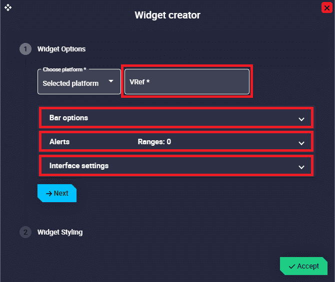
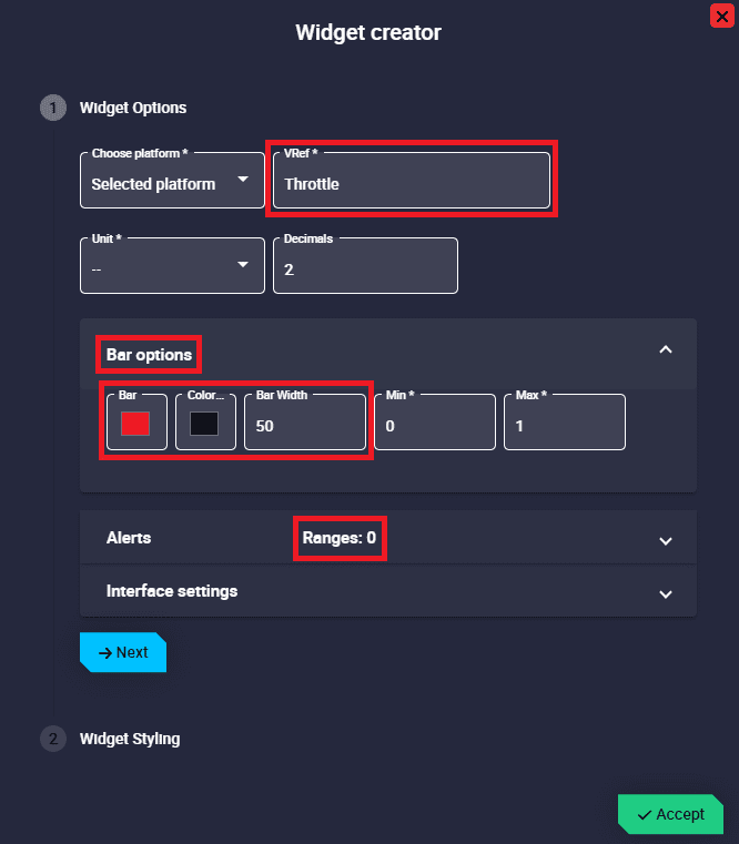
Bar configuration
Widget Options
This widget has extra edit parameters compared to the ones described in the Widget common configuration.
VRef: Users can choose any real, integer or bit variable to be displayed on the bar.
Unit and Decimals: Attention!! These are only available with Real variables.
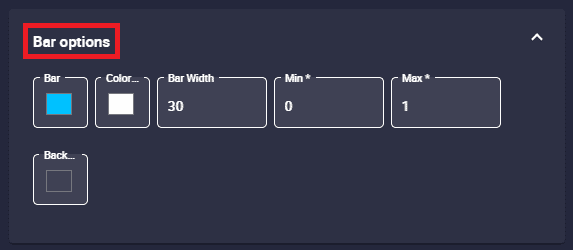
Bar options:
Bar configuration - Bar options
Bar color: The color of the bar with the value can be changed here.
Color text: The color of the selected variable value can be modified.
Bar width: The user can modify the width of the bar as desired. By default it is set to 30.
Min/Max: Minimum and maximum values displayed in the bar.
Background color: The color of the background bar can be set here.
For example, if the value is 0, the bar will be colored with this color. But if the value is 1, this color will be covered by the bar color specified in the parameter ‘Bar color’.
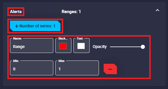
Alerts: Allows the user to set different ranges. For these ranges several customizations can be made:
Bar configuration - Alerts
Name: An indentifier name of the range can be set.
Background color: Sets the color of the bar for this range.
Text color: Changes the color of the selected variable value in this range.
Opacity: The opacity of the bar can be customized in this range.
Min/Max: Defines the minimum and maximum values of the range.
Remove: Click to delete this range.
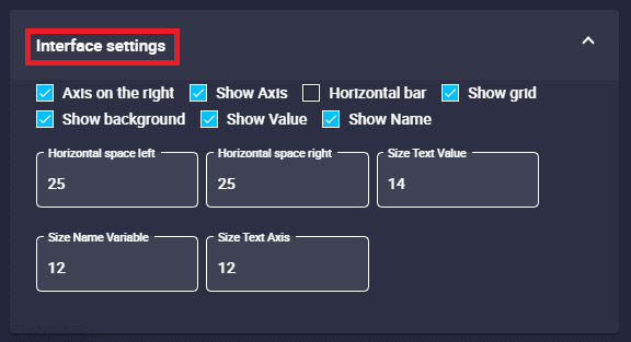
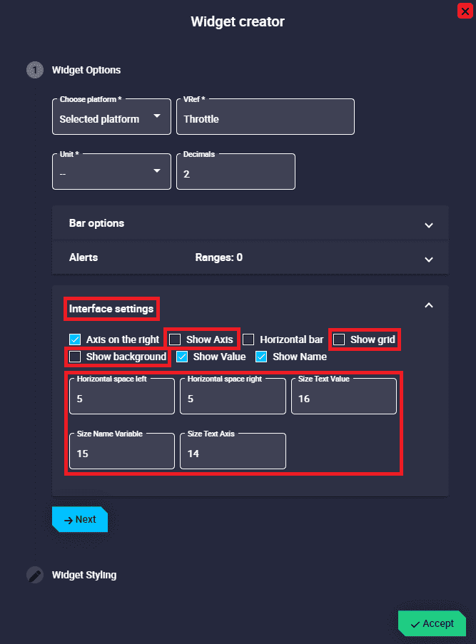
Interface settings:
Bar configuration - Interface settings
The appearance of the bar widget can be highly customized using the following parameters:
Axis on the right: If enabled, the axis is placed to the right of the bar, otherwise to the left. By default it is enabled.
Show axis: If enabled, the axis of the bar is shown, otherwise it is hidden. By default it is enabled.
Horizontal bar: If enabled, the bar and the axis are displayed in horizontal format, otherwise it is in vertical position. By default disabled (in vertical position).
Show grid: If enabled, a grid with the subdivisions of the axes is shown, otherwise it is hidden. By default it is enabled.
Show background: If enabled, the rest of the bar that is not colored by the value is shown with the color previously defined in Bar options. By default it is enabled.
Show Value: If enabled, shows the value of the selected variable in the bar. By default it is enabled.
Show Name: If enabled, the name of the selected variable is displayed at the bottom of the bar. By default it is enabled.
Horizontal space left/right: The left/right horizontal spacing of the bar widget background can be customized. By default they are set to 25.
Size Text Value: The size of the text value can be modified. Default is 14.
Size Name Variable: The size of the selected variable name can be changed. Default is 12.
Size Text Axis: The size of the axis text can be modified. Default is 12.
Some examples are given below:
Example 1:
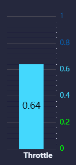
Bar example 1
The custom configuration made for this bar is as follows:
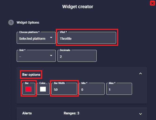
Bar configuration - Bar options example 1
As shown in the figure above, when the background bar is hidden (‘Show background’ option is disabled), the ‘Background color’ parameter does not appear.
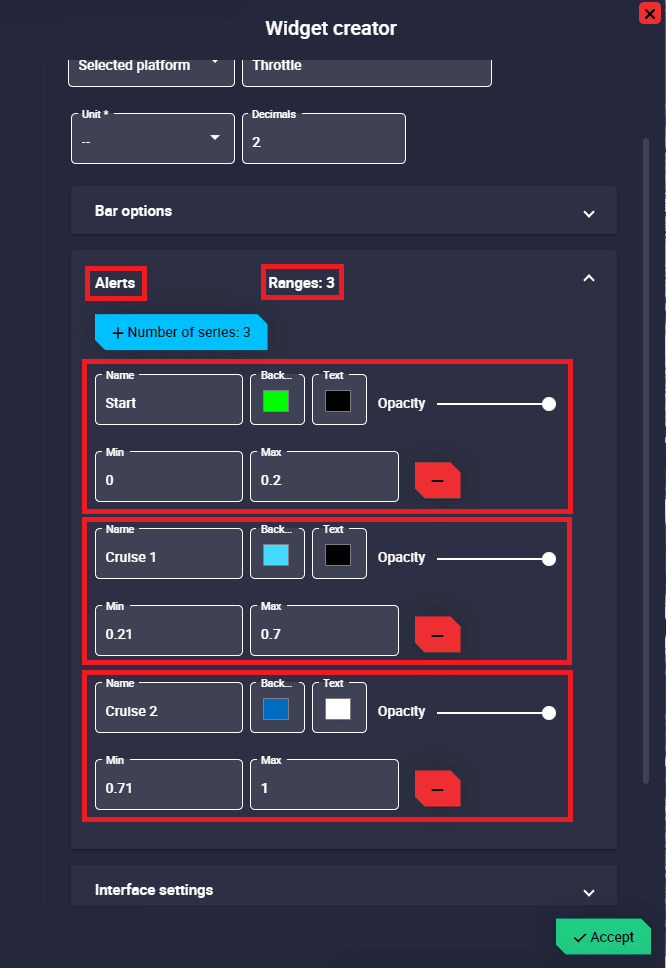
Bar configuration - Alerts example 1
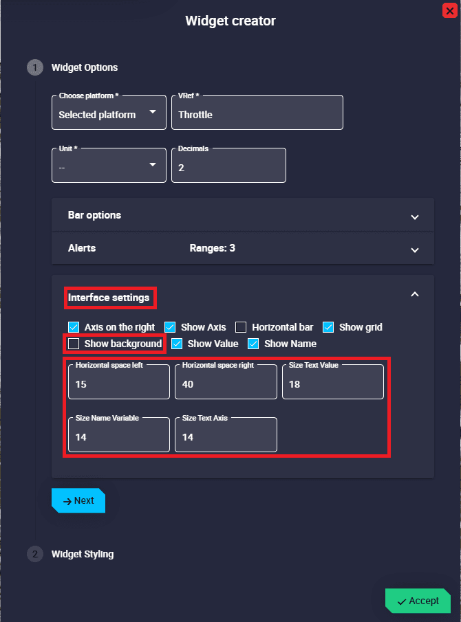
Bar configuration - Reference settings example 1
Example 2:
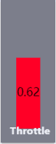
Bar example 2
The custom configuration made for this bar is as follows:
Bar configuration - Bar options example 2
As shown in the figure above, when the background bar is hidden (‘Show background’ option is disabled), the ‘Background color’ parameter does not appear.
In addition, as there is no range specified, the color of the bar will always be the one specified in the ‘Bar color’ parameter.
Bar configuration - Reference settings example 2
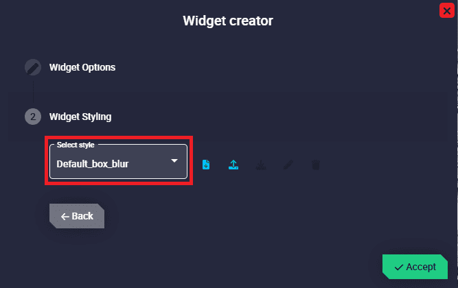
Bar configuration - Widget Styling example 2
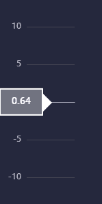
Roll Tape
Roll tape widget shows the value of the selected variable with a marker always in the centre position of the widget. It is also possible to add color ranges according to the values of the variable. In addition, a second variable can be used as a reference marker.
Roll Tape
Right click on the roll tape to access its options (Duplicate, Edit and Remove).
Options \(\rightarrow\) Edit: This allows the user to access the Roll Tape configuration menu.
Roll Tape configuration
Widget Options
This widget has extra edit parameters compared to the ones described in the Widget common configuration.
VRef: Users can choose any real, integer or bit variable to be displayed on the roll tape.
Unit and Decimals: Attention!! These are only available with Real variables.
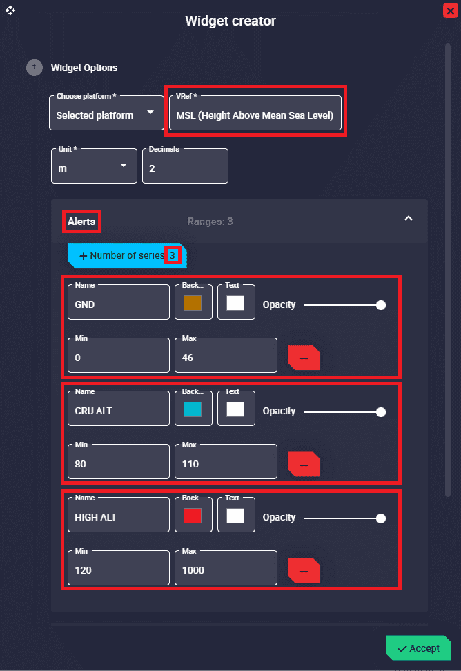
Alerts: Allows the user to set different ranges. For these ranges several customizations can be made:
Roll Tape configuration - Alerts
Name: An identifying name can be set for the range.
Background color: Sets the color of the roll tape for this range.
Text color: Sets the color of the range name for this range.
Opacity: The opacity of the roll tape can be customized in this range.
Min/Max: Defines the minimum and maximum values of the range.
Remove: Click to delete this range.
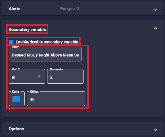
Secondary variable: A second variable can be added to be used, for example, as a reference.
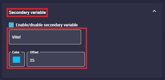
Roll Tape configuration - Secondary variable
Enable/disable secondary variable: If enabled, it is displayed as a marker.
VRef: Users can choose any real, integer or bit variable to be displayed on the roll tape as a secondary variable.
Unit and Decimals: Attention!! These are only available with Real variables.
Color: Sets the color of the secondary variable marker.
Offset: Horizontal position of the marker. By default it is set to 25.
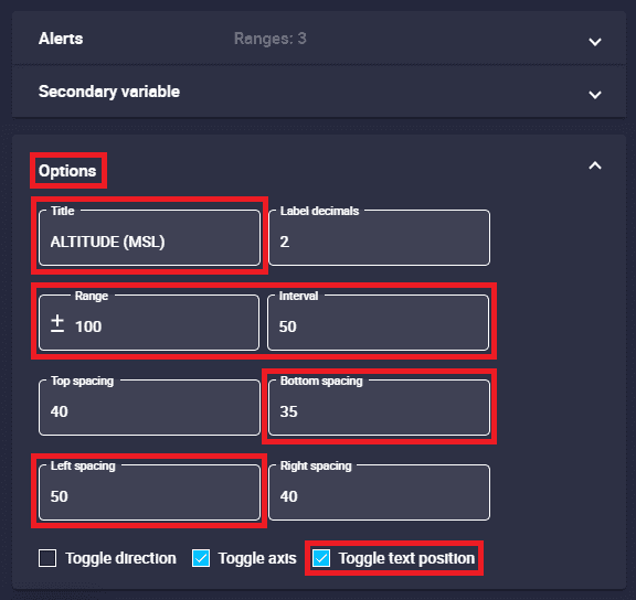
Options:
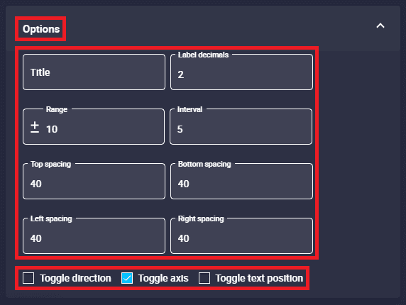
Roll Tape configuration - Options
The appearance of the roll tape widget can be customized using the following parameters:
Title: Title of the roll tape widget
Label decimals: Decimals of the value to be displayed on the roll tape. By default it is set to 2.
Range (+/-): Space between the center and the top and bottom boundaries. The default value is 10.
Interval: Axis interval. Default is 5.
Top/Bottom spacing: The top/bottom spacing of the roll tape widget background can be customized. The default value is 40.
Left/Right spacing: The left/right horizontal spacing of the roll tape widget background can be customized. The default value is 40.
Toggle direction: If enabled, the roll tape and the axis are displayed in horizontal format, otherwise it is in vertical position. By default disabled (in vertical position).
Toggle axis: If enabled, the axis is positioned to the left of the roll tape, otherwise to the right. By default it is enabled.
Toggle text position: If enabled, the previously defined title is positioned at the top of the widget, otherwise it is positioned at the bottom. By default disabled.
An example is given below:
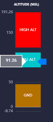
Roll Tape example
The custom configuration made for this roll tape is as follows:
Roll Tape configuration - Alerts example
Roll Tape configuration - Secondary variable example
Roll Tape configuration - Options example