Displays
Label
Depending on the type of variable selected, the appearance of the label (by default) is different.
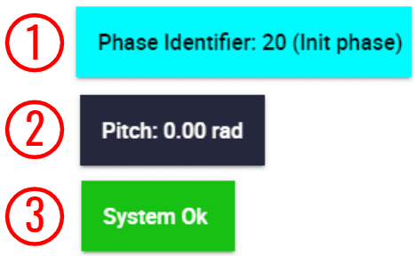
Label
Integer variables: Only the variable with its value is displayed.
Real variables: The units of the variable are displayed.
Bit variables: These labels have failure/success color.
Right click on the labels to access their options (Duplicate, Edit and Remove):
Options \(\rightarrow\) Edit: This allows the user to access the Label configuration menu.
Label configuration
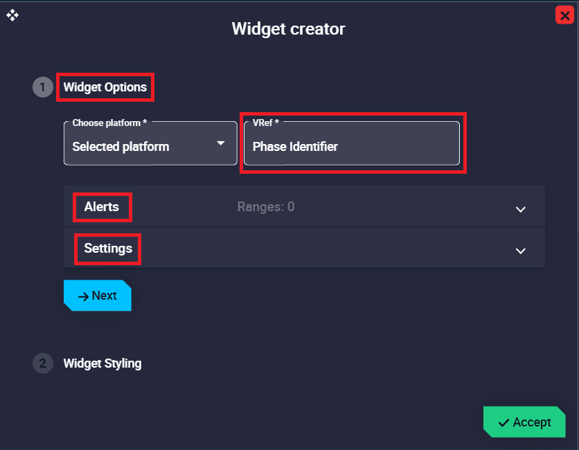
Widget Options
This widget has extra edit parameters compared to the ones described in the Widget common configuration.
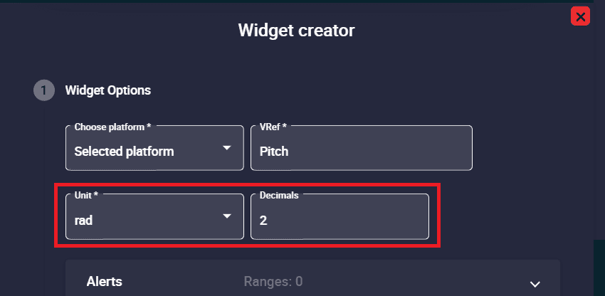
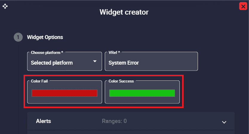
VRef: Users can choose any real, integer or bit variable to be displayed on the label.
Unit and Decimals: Attention!! These are only available with Real variables.
Real label configuration
Color fail/success: By default, when the bit variable is in ‘fail mode’, the label is red and when it is in ‘success mode’, it is green.
Attention!! This is only available with Bit variables.
Bit label configuration
Alerts: Allows the user to set different ranges. For this range several customizations can be made:
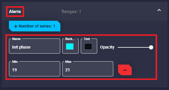
Label configuration - Alerts
Name: An indentifier name of the range can be set.
Background color: Changes the color of the label when the variable is in this range.
Text color: Changes the color of the label text when the variable is in this range.
Opacity: The opacity of the label can be customized in this interval.
Start/End: Defines the start and end values of the range.
Remove: Click to delete this interval.
Setttings: The ‘shape’ of the displayed text can be edited:
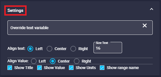
Label configuration - Settings
Override text variable: The label name can be changed by typing a new one different from the variable name.
Warning
This does not rename the selected variable in the configuration, it is only the name shown in the label.
Align text: The text of the variable can be left, center or right aligned.
Size text.
Align Value: The value of the variable can be left, center or right aligned.
Show Title/Value/Units: The title, value and units of the variable can be shown/hidden.
Show range name: If enabled, the name assigned to the range will appear next to the variable.
Alerts
These alerts are bits variables that only appear when in ‘failure mode’.
By default, they are displayed with an exclamation icon, in flashing red and with an alert sound. However, they can be customized accessing their edit menu.

Alerts
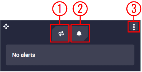
By hovering the mouse cursor over the widget, the following actions appear:
Alerts
Enable/Disable Loop: Users can enable/disable the sound of the alerts to be in loop, i.e. sounding continously.
Mute/Unmute all alerts: The sound of the alerts can be mute/unmute.
Options:
Duplicate: Duplicates this widget.
Edit: This allows the user to access the Alerts configuration menu.
Alerts configuration
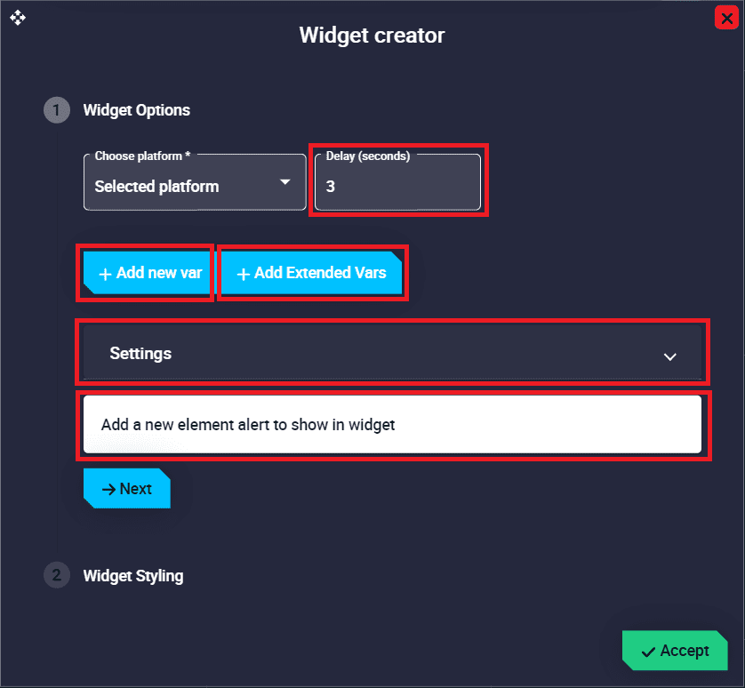
Widget Options
This widget has extra edit parameters compared to the ones described in the Widget common configuration.
Delay: This is the time (in seconds) between the sounding of alerts when the loop option is enabled.
Add new var: Press this button to add a new alert variable. They are configured below.
Add Extended Vars: All bit variables of the autopilot status message will be added as alerts.
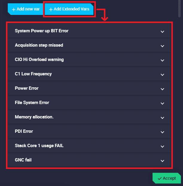
Alerts configuration - Extended Vars
Add a new element alert to show in widget: When adding a variable (by clicking on the ‘Add new var’ button or the ‘Add Extended Vars’ button), the following configurable field is added to the configuration menu:
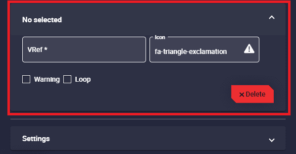
Alerts configuration - Variables
VRef: Users can select the desired bit variable to be displayed as an alert.
Icon: Choose the icon to be displayed next to the variable. By default, it is an exclamation icon, as can be seen in the figure above.
Warning: If enabled, the selected alert will be displayed in orange instead of red.
Loop: If enabled, the sound of the selected alert will be looped with the delay time specified above. Otherwise, the alert sound will only play when the alert is triggered.
For example, if the delay is set to 3 seconds, the loop option is enabled and the selected variable is in fail mode, the alert sound will sound every 3 seconds.
Delete.
Settings: Here the user can modify the settings common to all alerts:
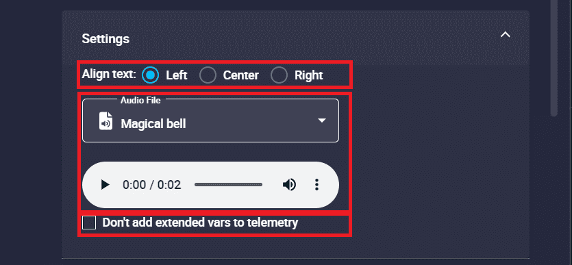
Alerts configuration - Settings
Align text: The variable text can be aligned left, centre or right.
Audio File: Users can select the audio of the alert from the audio list. The volume and speed of the audio can be customized.
Don’t add extended vars to telemetry: If enabled, extended variables will not be added to the complementary telemetry. They will be read from the autopilot status message.
Remove: Deletes this widget.
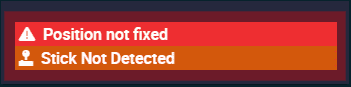
Some examples of alerts are shown below:
Alerts example
The following figures show how these alerts have been configured:
Stick not detected: This alert has been defined as a warning and its icon has been replace by another icon more related to the variable (a joystick icon).
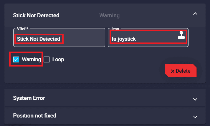
Alerts configuration example
System Error: Although this variable has been configured as an alert, it does not appear as such. This is because it is not in ‘failure mode’.
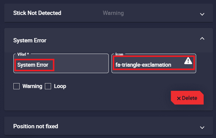
Alerts configuration example
Position not fixed: This alert has not been customized, it appears with the default configuration.
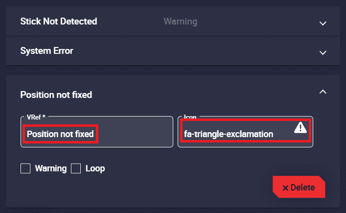
Alerts configuration example
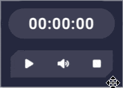
Timer
This widget is a counter, which can also function as a countdown counter if configured as such.
Timer
Right click on the widget to access its options (Duplicate, Edit and Remove).
Options \(\rightarrow\) Edit: This allows the user to access the Timer configuration menu.
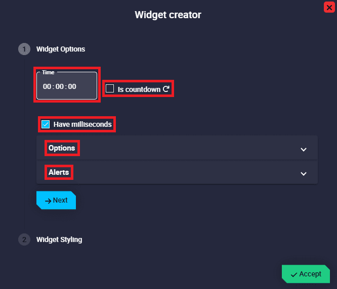
Timer configuration
Widget Options
This widget has different edit parameters compared to the ones described in the Widget common configuration.
Time: Users must enter the desired counter time. Note that if the Is countdown checkbox is enabled, this becomes the countdown time.
Is countdown: Enabling this option turns the widget into a countdown timer. Default is disabled.
Have milliseconds: If enabled, the time will be displayed with milliseconds. By default it is enabled.
Options: Users can set a warning time, color and sound for when the timer reaches the end of the set counter/countdown time.
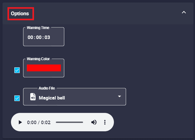
Timer configuration - Options
Warning Time: Time for the color and/or sound to be displayed until the end of the counter/countdown time.
Warning Color: If enabled, this color shall be displayed flashing continuously from the time the warning time is reached until the end of the counter/countdown.
Audio File: If enabled, the audio that users have selected from the audio list will play when the warning time is reached, sounding continuously until the end of the counter/countdown.
For example, if the audio file has a duration of 2 seconds and the warning time is set to 3 seconds, the audio will start playing for the first time from 3 seconds left until 1 second left and then play for the second time from 1 second left until the end. In other words, the audio will sound 1.5 times.
Important
If Warning Color and Audio File parameters are disabled, the warnings will be disabled.
For example, if the timer is configured as a countdown with a time of 8 seconds and the warning time is set to 3 seconds, the widget will be displayed with the color and/or sound defined here each of those final 3 seconds, i.e. from 3 to 0 seconds:
Timer - Countdown example
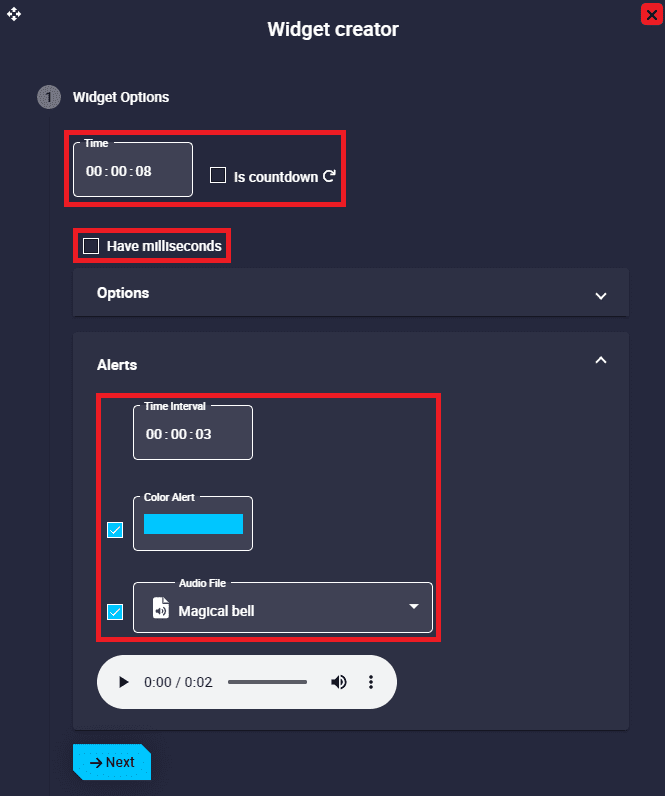
Alerts: Light and/or sound alerts can be activated every certain specified time.
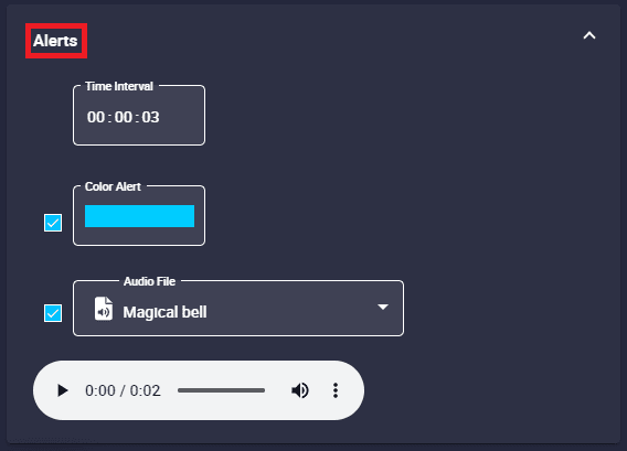
Timer configuration - Alerts
Time Interval: The time interval for the light and sound alerts is set here.
Color Alert: If enabled, the timer will have a light alert with the color specified here when the time interval elapses.
Audio file: If enabled, the timer will have an audible alert with the audio specified here when the time interval elapses.
Users can select the audio of the alert from the audio list.
Important
If Color Alert and Audio File parameters are disabled, the alerts will be disabled.
An example is given below:
Timer - Alert example
Timer - Alert example