5. Workspace
Workspace toolbar
Workspace settings allow the user to customize any information to be displayed on the screen for monitoring the operation.
Attention
Although Veronte Ops cannot be extended to multiple screens, it is possible to open more than one Veronte Ops in order to display all the widgets necessary for the operation.
Map options
The map widget configures the background map that appears in Veronte Ops screen.
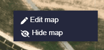
By right clicking on the map the following map options are available:
Map options
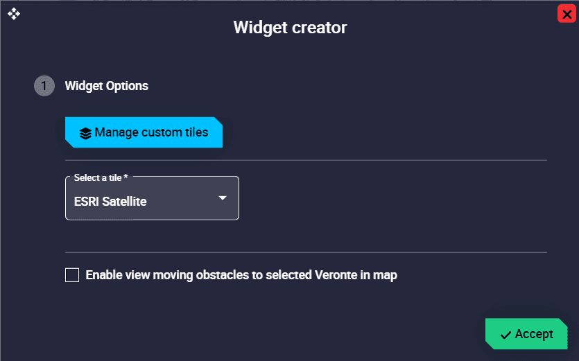
Edit map: In this menu the following options can be configured:
Edit map option
Manage custom tiles: This menu allows the user to add and manage their own map tiles.
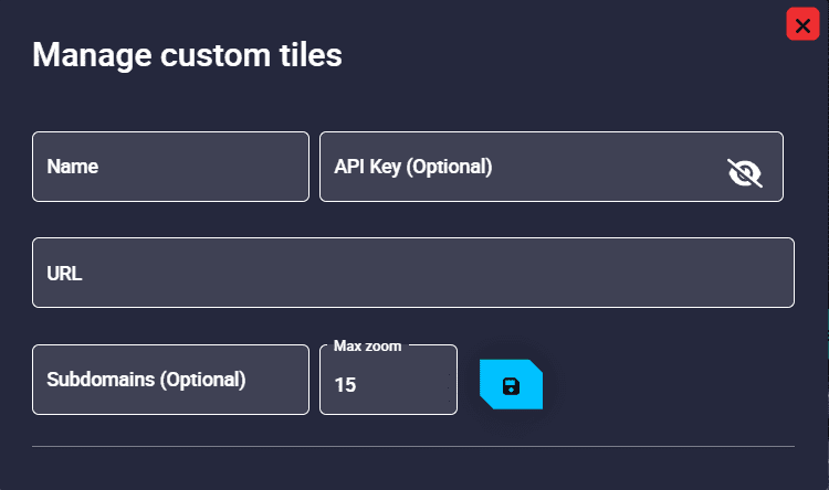
Manage custom tiles
Select a tile: It is possible to select the map provider from a number of options.
Enable view moving obstacles to selected Veronte in map
Hide map: The map will be hidden. To show it again, go to ‘Main Widgets’ menu and select ‘Map’.
In addition, double-clicking on the map will zoom in on the area where it is located.
Furtheremore, the map can be minimized/maximized by clicking on the  icon in the top right corner of the application. An example is shown below:
Minimize/Maximize map
Workspace toolbar
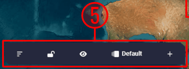
The workspace toolbar is divided into 5 different ‘parts’:
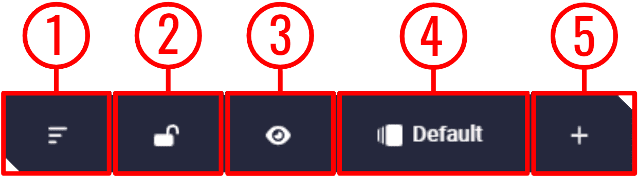
Workspace toolbar parts
Sort widgets: With this button it is possible to sort the widgets, i.e. the user can place one widget on top of another.
To do this, click on this button and a ‘sorting panel’ will appear for the user to sort widgets, so that the first in the list will be on top of the second, the second on top of the third and so on.
For ease of use, the widget selected for sorting will be outlined in blue, as shown in the example below:
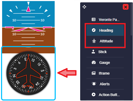
Sort widgets
In this example, ‘Heading widget’ is selected and is ordered above the ‘Attitude widget’.
Warning
The map will always be at the back (the last widget in the list), except when minimized, which can be sorted as desired.
Lock/Unlock widgets: When widgets are locked, users will not be able to move them.
Show/Hide widgets: Users can choose to show/hide all widgets by pressing this button.
Workspaces: Users can have different workspaces for different missions, operations, tests, etc.
Widgets: Veronte Ops offers several applications to display parameters and variables in real time of the flight mission.
Workspaces
By clicking here, a list of all workspaces loaded in Veronte Ops will appear. The current workspace is the one that is selected, the one shown in blue.
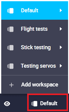
Workspaces
The following options are available for each workspace:
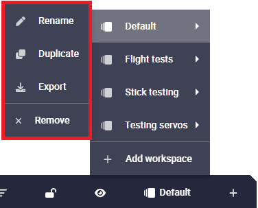
Workspaces options
Rename: The user can rename the workspace as desire.
Duplicate: Duplicates this workspace.
Export: The current workspace can be exported. This file is exported in
.jsonformat.Remove: Clicking here will delete the selected workspace.
Note
It is possible to delete several or all workspaces at once from the Workspace manager menu of the Status bar, click here for more infromation.
Adding a workspace
It is posible to create a new workspace by simply clicking on ‘Add workspace’.
The user can choose between adding an empty workspace or importing one from the laptop, which has been previously exported.
To import a workspace, the format file must be a .json.
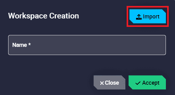
Add workspace
Widgets
By clicking here, the user will see different widget menus sorted by categories.
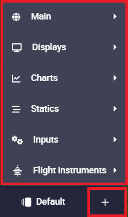
Widgets
To display any widget on the map, just search for the desired widget and configure it.
Warning
In order for the widgets to correctly receive data from the variable they represent, i.e. the variable that has been selected in their configuration, it is necessary that this variable has been added to the Data to Vapp telemetry vector in the telemetry configuration of the 1x PDI Builder software. For more information, see the Data to Vapp -> Telemetry section of the 1x PDI Builder user manual.
Therefore, users should add to that telemetry vector all normally used variables, as well as those variables of the current configuration that are expected to be used during operation.
Otherwise, if the variable configured for a widget is not present in the telemetry configuration of the PDI, the widget will appear with a red triangle (warning icon), which means that the variable selected for this widget is not being received in Veronte Ops:
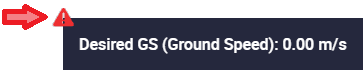
Not receiving telemetry in this widget
To fix this, users can simply add this variable to the complementary vector telemetry by uploading the current operation to the platform configuration. However, this complementary vector telemetry is always running at a frequency of 10 Hz (not configurable) and the variables are sent uncompressed.
It is therefore recommended to add the variables to the Data to Vapp telemetry vector to configure the desired frequency, the compression/uncompression of the variables, etc.
Widgets common configuration
Warning
This does not apply to widgets in the ‘Statics’ category.
All widget editing menus except those in the ‘Statics’ category have at least the following configurable parameters:
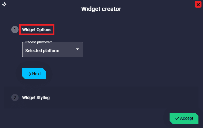
Edit menu - Widget Options
Choose platform: Users must select the platform for which the widget is configured. The available options will always be the IDs of the connected autopilots 1x and ‘Selected platform’, i.e. the platform that is selected.
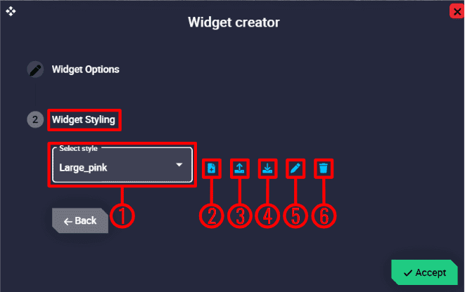
Edit menu - Widget Stylying
Here the user can choose the style of the widget:
Select style: Default and custom styles can be selected. The available default styles are Default_box, Default_box_transparent, Default_box_blur, Default_box_black, Default_pill and Default_pill_blur.
Note
Not all these default styles are available in all widgets.
Add new style: A new style can be created here.
Import style: Users can import a custom style from local storage. It must be a
.cssfile.Export style: By clicking here, the selected custom style will be exported in a zip folder. More information about the contents of this folder is described in Status bar - Style manager section of this manual.
Important
This option is only available when a custom style is selected.
Edit style: Users can directly edit the configuration (code) of the selected style by clicking here.
Important
This option is only available when a custom style is selected.
Remove style: The selected style will be deleted.
Important
This option is only available when a custom style is selected.
All widgets are explained in detail in the following sections: