Displays
Label
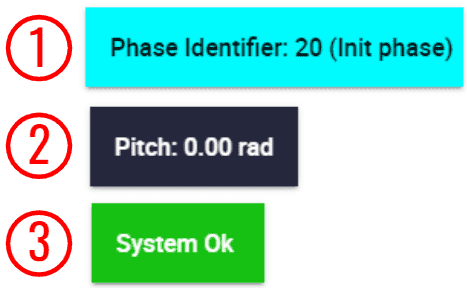
Depending on the type of variable selected, the appearance of the label (by default) is different.
Label
Integer variables: Only the variable with its value is displayed.
Real variables: The units of the variable are displayed.
Bit variables: These labels have failure/success color.
Right click on the labels to access their options (Duplicate, Edit and Remove):
Options \(\rightarrow\) Edit: This allows the user to access the Label configuration menu.
Label configuration
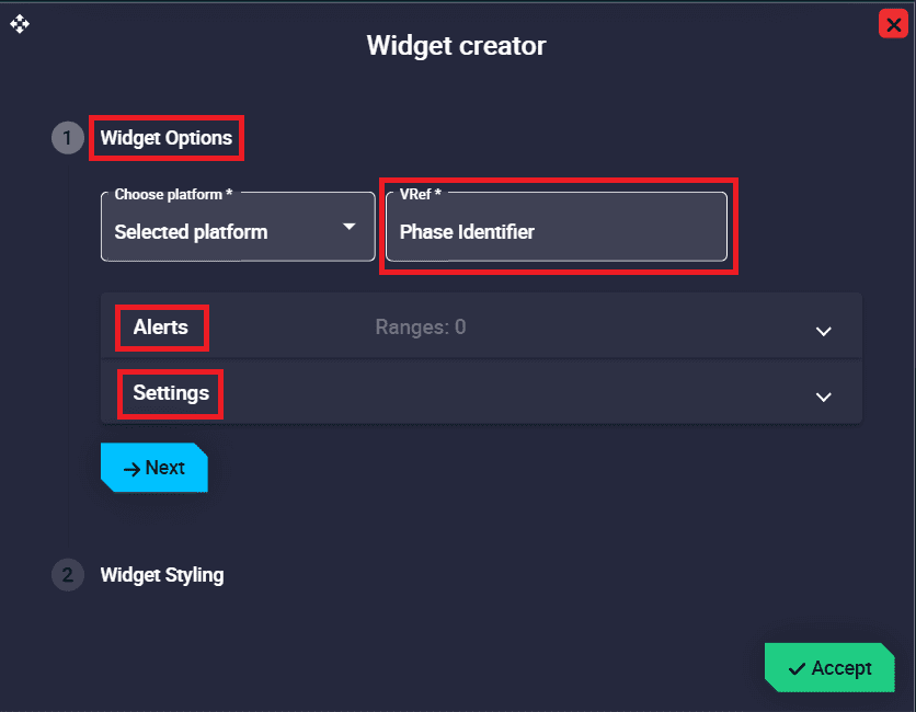
Widget Options
This widget has extra edit parameters compared to the ones described in the Widget common configuration.
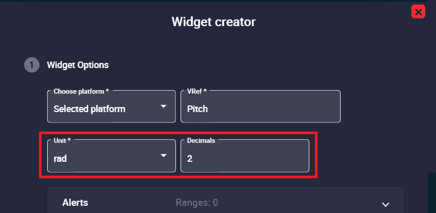
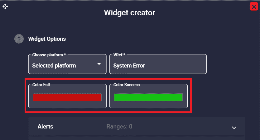
VRef: Users can choose any real, integer or bit variable to be displayed on the label.
Unit: Unit of measurement of the displayed variable.
Note
This parameter is only available with Real variables.
Decimals: Number of decimals displayed for the selected variable.
Note
This parameter is only available with Real variables.
Real label configuration
Color Fail/Success: By default, when the bit variable is in ‘fail mode’, the label is red and when it is in ‘success mode’, it is green.
Note
This is only available with Bit variables.
Bit label configuration
Alerts: Allows the user to set different ranges. For this range several customizations can be made:
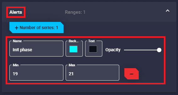
Label configuration - Alerts
Name: An indentifier name of the range can be set.
Background color: Changes the color of the label when the variable is in this range.
Text color: Changes the color of the label text when the variable is in this range.
Opacity: The opacity of the label can be customized in this interval.
Min/Max: Defines the minimum and maximum values of the range.
Remove: Click to delete this interval.
Setttings: The ‘shape’ of the displayed text can be edited:
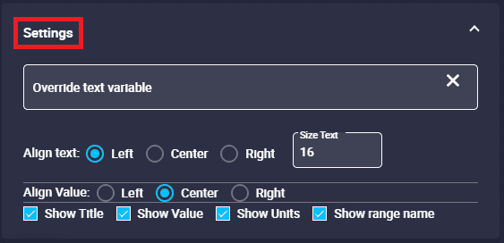
Label configuration - Settings
Override text variable: The label name can be changed by typing a new one different from the variable name.
Warning
This does not rename the selected variable in the configuration, it is only the name shown in the label.
Align text: The text of the variable can be left, center or right aligned.
Size text.
Align Value: The value of the variable can be left, center or right aligned.
Show Title/Value/Units: The title, value and units of the variable can be shown/hidden.
Show range name: If enabled, the name assigned to the range will appear next to the variable.
Alerts
These alerts are bits variables that appear depending on the state of the bit, failure or success. The user can define in the widget configuration which of them will be the triggering state.
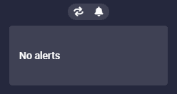
By default, alerts are “collapsed” into the widget, as the widget acts as a drop-down menu. However, users can quickly find out how many alerts there are and what type they are without having to drop it down thanks to the colored indicators in the form of pills:
Red: Alerts on failure state
Orange: Alerts in failure state and configured as warnings
Green: Alerts in success state
Grey: Alerts for which the necessary telemetry is not being received.
Note
This color code is also extended to the displayed alerts.
The alert type can be configured by accessing its edit menu.
Alerts
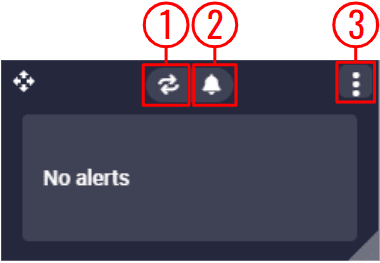
By hovering the mouse cursor over the widget, the following actions appear:
Alerts
Enable/Disable Loop: Users can enable/disable the sound of the alerts to be in loop, i.e. sounding continously.
Mute/Unmute all alerts: The sound of all alerts can be mute/unmute.
Options:
Duplicate: Duplicates this widget.
Edit: This allows the user to access the Alerts configuration menu.

Alerts configuration
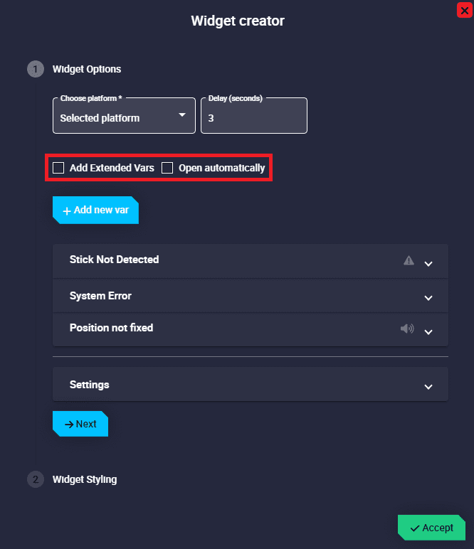
Widget Options
This widget has extra edit parameters compared to the ones described in the Widget common configuration.
Delay: This is the time (in seconds) between the sounding of alerts when the loop option is enabled.
Add Extended Vars: If enabled, all bit variables of the autopilot status message will be added as alerts. For more information on status message variables, please refer to the Status Message Variables - Lists of interest section of the 1x Software Manual.
Open automatically: If enabled, Alerts widget will automatically “expand” when a configured alert is triggered.
Note
This check only takes effect when the widget is not deployed.
Add new var: Press this button to add a new alert variable. They are configured below.
Add a new element alert to show in widget: When adding a variable (by clicking on the ‘Add new var’ button), the following configurable field is added to the configuration menu:
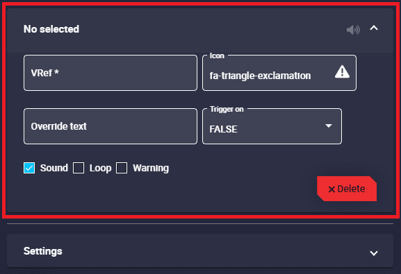
Alerts configuration - Variables
VRef: Users can select the desired bit variable to be displayed as an alert.
Icon: Choose the icon to be displayed next to the variable. By default, it is an exclamation icon, as can be seen in the figure above.
Override text: The alert name can be changed by typing a new one different from the variable name.
Warning
This does not rename the selected variable in the configuration, it is only the name shown in the alert.
Trigger on: Users can choose when they want the alert to be displayed, when FALSE or TRUE. By default, FALSE is set.
Sound: Here users can choose whether each alert sounds or not by simply enabling/disabling it. By default, it is activated.
Loop: If enabled, the sound of the selected alert will be looped with the delay time specified above. Otherwise, the alert sound will only play when the alert is triggered.
For example, if the delay is set to 3 seconds, the loop option is enabled and the selected variable is in fail mode, the alert sound will sound every 3 seconds.
Important
This is only available when Sound is activated.
Warning: If enabled, the selected alert will be displayed in orange instead of red.
Delete.
Settings: Here the user can modify the settings common to all alerts:
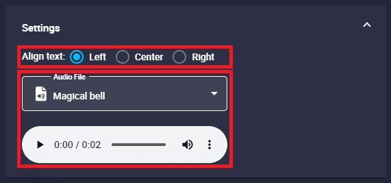
Alerts configuration - Settings
Align text: The variable text can be left, center or right aligned.
Audio File: Users can select the audio of the alert from the audio list.
Remove: Deletes this widget.
Some examples of alerts are shown below:

Alerts example
The following figures show how these alerts have been configured:
Alerts configuration example
Stick Not Detected: This alert has been defined as a warning, its icon has been replace by another icon more related to the variable (a joystick icon) and has been configured without sound.

Alerts configuration example - Stick Not Detected
System Error: This variable has been configured as an alert but it is triggered in successful state, so it is colored green. In addition, it has been customized with a different text from the variable name, with a ‘check’ icon and no sound.
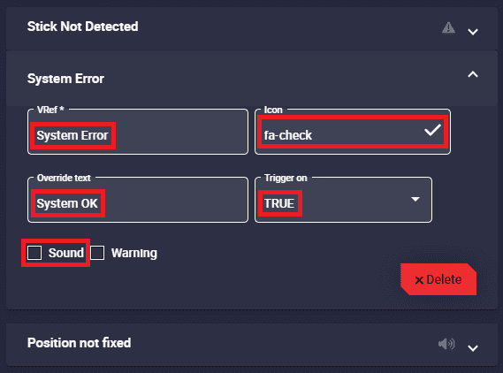
Alerts configuration example - System Error
Position not fixed: This alert has not been customized, it appears with the default configuration.

Alerts configuration example - Position not fixed