Inputs
Veronte Ops allows the user to modify some variables during a flight to test some parameters or to simulate a stick control.
Slider
Slider widgets allow the user to choose a certain variable and change its value by simply moving the slider to the desired value from the workspace during a flight.
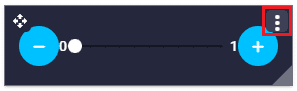
Slider
Click the  button to access its options (Duplicate, Edit and Remove).
Options \(\rightarrow\) Edit: This allows the user to access the Slider configuration menu.
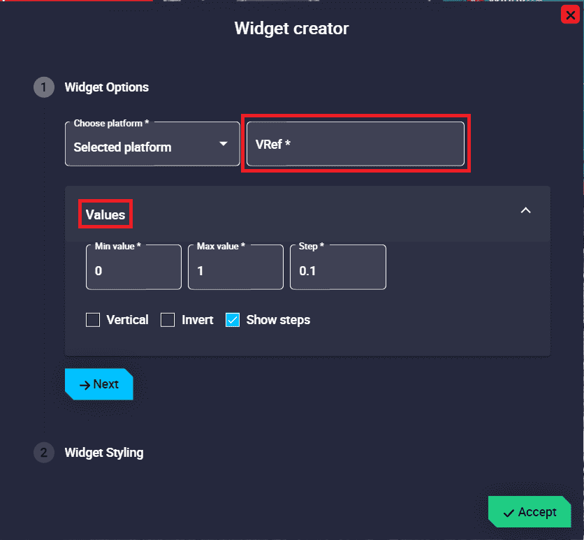
Slider configuration
Widget Options
This widget has extra edit parameters compared to the ones described in the Widget common configuration.
VRef: Users can choose any real, integer or bit variable to be displayed on the slider.
Unit: Unit of measurement of the displayed variable.
Note
This parameter is only available with Real variables.
Values:
Min/Max value: Minimum and maximum values displayed in the slider. Defaults are 0 and 1 respectively.
Step: Here users must enter the step they want the slider to have. By default it is set to 0.1.
Vertical: If enabled, the slider widget is displayed in vertically, otherwise it is displayed horizontally. By default disabled (in horizontal position).
Invert: If enabled, the minimum and maximum values are swapped, otherwise the minimum value is to the left of the widget and the maximum value to the right. By default disabled.
Show steps: If enabled, the step divisions of the slider are shown when interacting with the widget, otherwise they are hidden. By default it is enabled.
An example is given below:
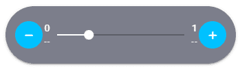
Slider example
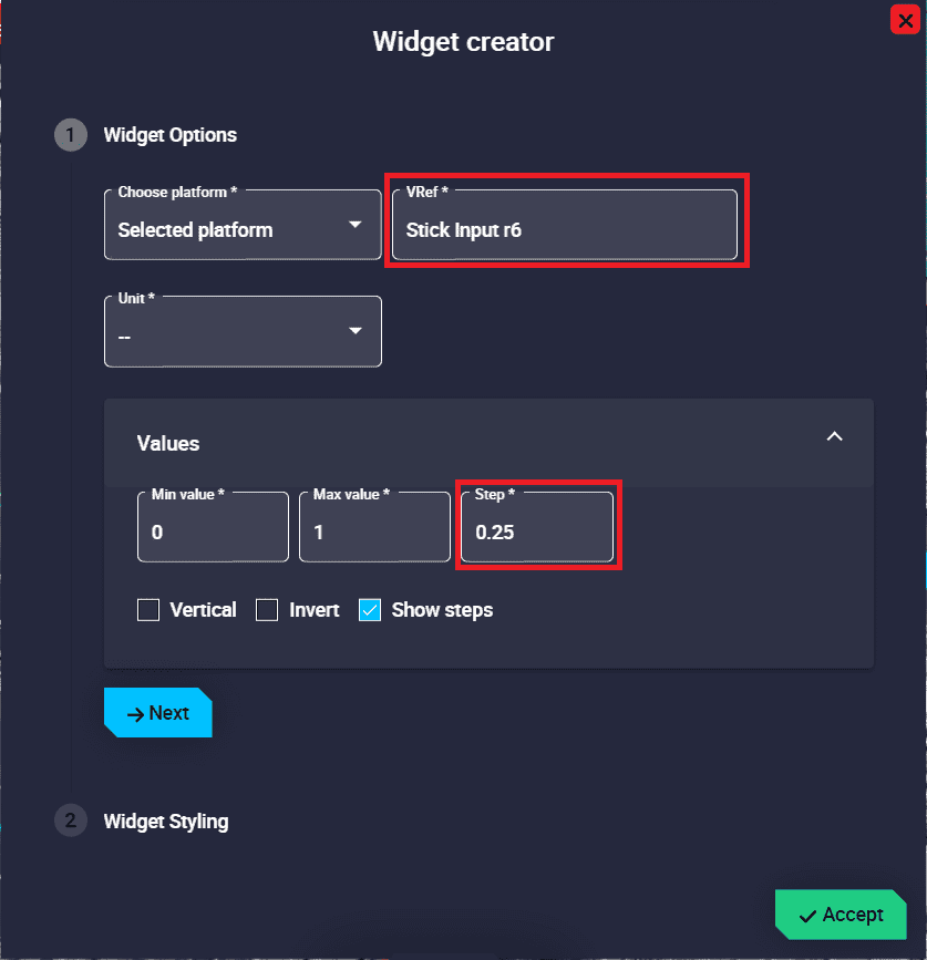
Slider configuration example
Action Button
Action Button widgets can be added to the workspace independently and also be displayed all together embedded in the Veronte Panel.
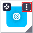
Action Button
Click the button to access its options (Duplicate, Edit and Remove).
Options \(\rightarrow\) Edit: This allows the user to access the Action Button configuration menu.
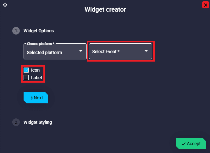
Action Button configuration
Widget Options
This widget has extra edit parameters compared to the ones described in the Widget common configuration.
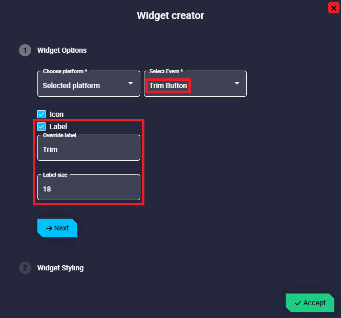
Select Event: Select the desired button event to be displayed as an action button. This event must be previously configured as a button automation in the 1x PDI Builder software.
Icon: If enabled, the icon already configured for this event in the corresponding automation button is drawn. By default it is enabled.
Label: If enabled, users can add a desired text to be displayed on the action button next to the icon. By default, it is disabled.
Override label: Enter the desired text to be displayed in the widget. If no text is entered, the name of the selected event will be shown.
Label size: Size of the text displayed on the action button. Default is 16.
The triggering of linked actions is subjected to the button configuration carried out in 1x PDI Builder:
No time control: The action is triggered when the button is pressed.
Action button - No time control
Time control: The action is triggered when the button is pressed during the configured time.
Action button - Time control of 3s
An example of the configuration of an Action button widget is given below:

Action Button example
Action Button configuration example
Input Data
Input Data widgets allow the user to choose a certain variable and change its value by manually entering the value and sending it to the platform from the workspace during a flight.
Input Data
Click the button to access its options (Duplicate, Edit and Remove).
Options \(\rightarrow\) Edit: This allows the user to access the Input Data configuration menu.
Input Data configuration
Widget Options
This widget has extra edit parameters compared to the ones described in the Widget common configuration.
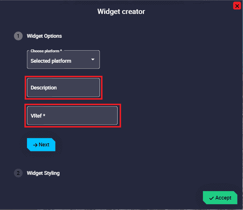
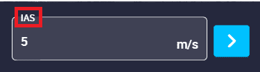
Description: A description can be added to the widget by substituting the selected variable name.
VRef: Users can choose any real, integer or bit variable to be displayed on the widget.
Unit: Unit of measurement of the displayed variable.
Note
This parameter is only available with Real variables.
An example is given below:
Input Data example
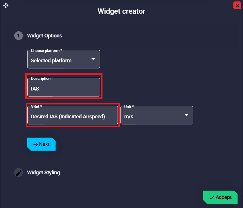
Input Data configuration example
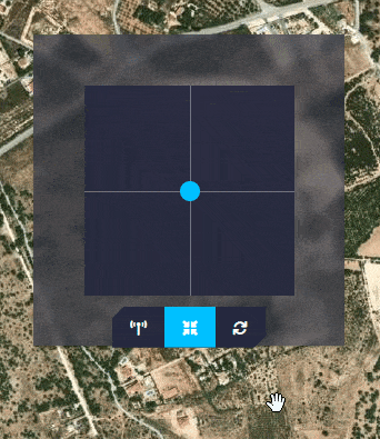
Stick
Stick (Virtual stick) widgets are created to simulate a radio controller that controls the platform channels directly from the computer.
Stick
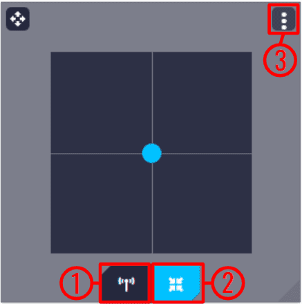
On the stick display, there are 3 icons/buttons and their functions are as follows:
Send command enable/disable: Enables/Disables the virtual stick commands.
Warning
If the Stick is not actived, it will have no effect on the system.
Go to center: Returns the stick to the center.
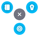
Options
Duplicate: Duplicates this widget.
Edit: This allows the user to access the Stick configuration menu.
Stick configuration
Widget Options
This widget has extra edit parameters compared to the ones described in the Widget common configuration.
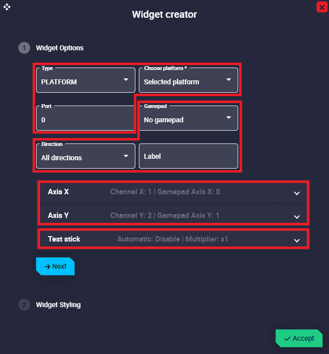
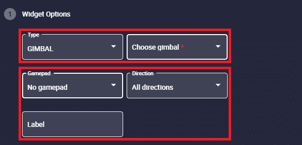
Type: Users can configure the widget stick to be used in “normal” mode, i.e. to control the platform, or to control a gimbal instead.
Stick configuration - Gimbal type
Choose platform/gimbal: Depending on the type selected, the user will have to choose the platform or the gimbal for which the widget is configured.
Port: As it is possible to have more than one stick configured, each transmitter must be configured on a different port.
This port must match the port configured in the 1x PDI Builder software. For more information, see the Output - Stick section of the 1x PDI Builder user manual.
Important
This parameter is only available when PLATFORM type is selected.
Gamepad: Users must select a desired gamepad from the list for which the widget is configured.
Important
If no physical gamepad (via USB) is connected to the PC, No gamepad option will be selected.
Direction: The user has to configure the directions in which the stick can be moved, the available options are All directions, Only vertical and Only horizontal. By default, ‘All directions’ option is selected.
Label: If there is more than one stick widget, users can easily differentiate between them by configuring an identifying label for each one.
Axis X/Y: X and Y axes must be configured.
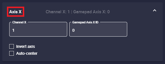
Stick configuration - Axis X
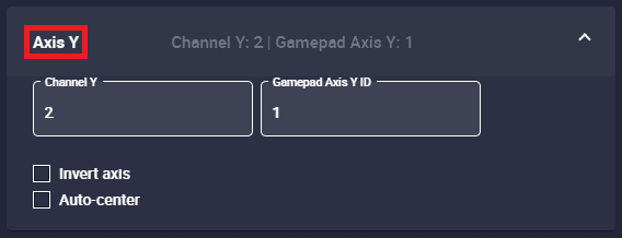
Stick configuration - Axis Y
Channel X/Y: Select which channel is controlled by each axis. By default, channel 1 is configured for the X axis and channel 2 for the Y axis.
Gamepad Axis X/Y ID: Correlation of the physical gamepad axis IDs with those of the virtual stick.
Important
If no physical gamepad (via USB) is connected, this parameter has no effect on the widget. It can be left at the default value.
Invert axis: If enabled, the minimum and maximum of the axis in the variable associated with this channel will be inverted.
For example, if in the Y axis, the bottom of the axis corresponds to a value of 0 in the stick input r2 variable. If the Inverted axis is enabled, now the bottom of the axis will correspond to a value of 1 in the variable.
Auto-center: When activated, the stick automatically returns to the center position when released.
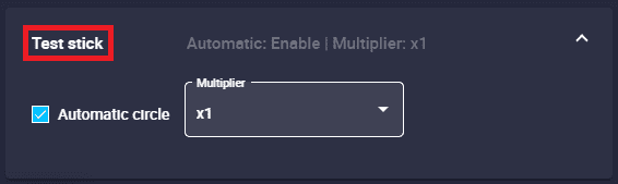
Test stick: This option is used to generate stick inputs that are introduced in the system. This is a way to check how the system behaves when a stick command enters the autopilot.
Stick configuration - Test stick
Automatic circle: An automatic circle test is activated.
Multiplier: The speed of the test can be adjusted. Available options are: x1, x2, x4, x8 and x16.
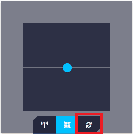
An additional button appears in the widget to start/stop the test.
Stick configuration - Test stick button
An example is presented below:
Stick configuration - Test stick example
Remove: Deletes this widget.
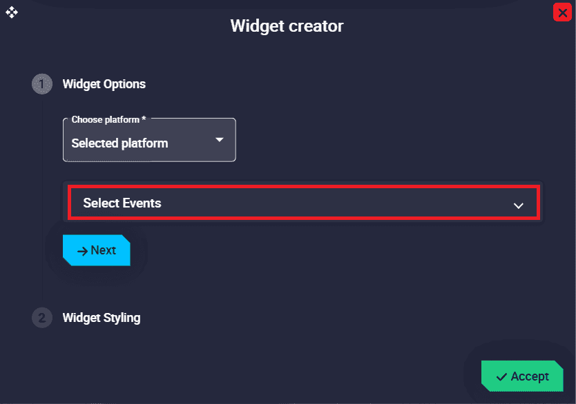
Dial Button
Dial Button widget groups different action buttons into a single ‘drop-down’ button.

Dial Button
When clicked, the action buttons will appear/disappear.
Dial Button - Action buttons
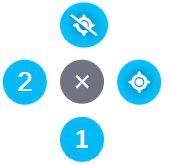
Right click on the widget to access its options (Duplicate, Edit and Remove).
Options \(\rightarrow\) Edit: This allows the user to access the Dial Button configuration menu.
This widget has only one extra edit parameter compared to the ones described in Widget common configuration:
Dial Button configuration
Widget Options \(\rightarrow\) Select Events: Select the desired button events that will be displayed as action buttons on the Dial Button. These events must be previously configured as automations in the 1x PDI Builder software.
An example is given below:
Dial Button example
These action buttons can be ordered in the configuration:
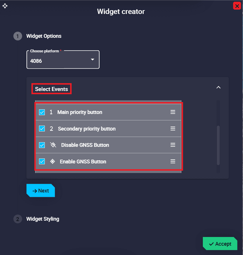
Dial Button configuration example
Gimbal Buttons
Gimbal Buttons widget groups different control buttons of the selected gimbal into a single ‘drop-down’ button.
Gimbal Buttons
When clicked, the control buttons will appear/disappear.
Right click on the widget to access its options (Duplicate, Edit and Remove).
Options \(\rightarrow\) Edit: This allows the user to access the Gimbal Buttons configuration menu.
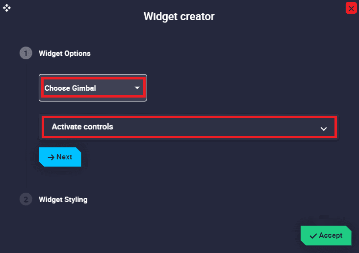
Gimbal Buttons configuration
Widget Options:
Choose Gimbal: The user has to choose from the gimbal predefined list the gimbal for which the widget is configured.
Activate controls: Select the desired controls of the selected gimbal that will be displayed on the Gimbal Buttons.
Important
The controls shown here depend on the selected gimbal, each gimbal has its own control buttons.
Below is an example with the NextVision gimbal:
Gimbal Buttons example
These control buttons can be enabled/disabled in the configuration:
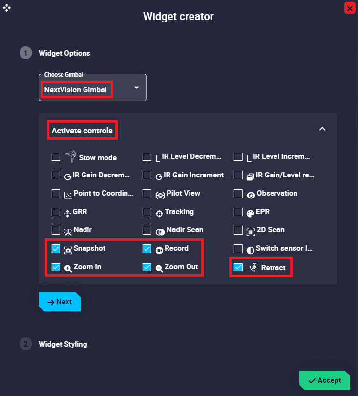
Gimbal Buttons configuration example
Gimbal Setup
Gimbal Setup widget is a gimbal configuration panel, where the user can choose which gimbal controls can be managed from Veronte Ops.

Gimbal Setup
Note that, as this widget behaves like a drop-down menu, clicking on the  icon will display all gimbal controls:
Gimbal Setup deployed
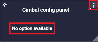
Note
As no controls have been configured yet, No option available is displayed when deployed.
Click the button to access its options (Duplicate, Edit and Remove).
Options \(\rightarrow\) Edit: This allows the user to access the Gimbal Setup configuration menu.
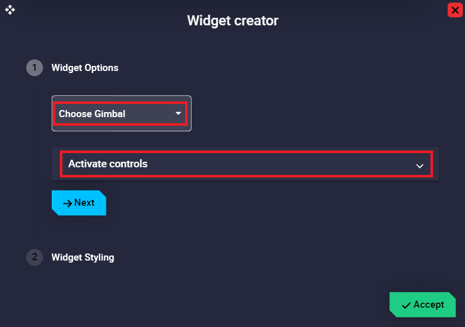
Gimbal Setup
Widget Options:
Choose Gimbal: The user has to choose from the gimbal predefined list the gimbal for which the widget is configured.
Activate controls: Select the desired controls of the selected gimbal that will be displayed on the gimbal configuration panel.
Important
The controls shown here depend on the selected gimbal, each gimbal has its own controls.
Below is an example with the NextVision gimbal:
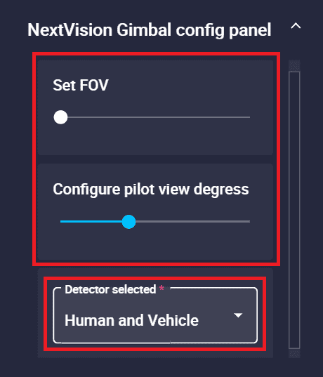
Gimbal Setup example
These controls can be activated/deactivated in the configuration:
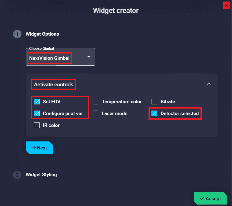
Gimbal Setup configuration example
As can be seen in the example above, these controls can be in form of sliders, drop-down menus, etc.
Important
This will also depend on the pre-configured controls for each gimbal model.
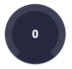
Knob
Knob widget is similar to the slider widget but in circular format. It also allows the user to choose a certain variable and change its value by simply moving the circular bar to the desired value from the workspace during a flight.
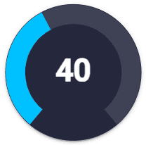
Knob
Right click on the widget to access its options (Duplicate, Edit and Remove).
Options \(\rightarrow\) Edit: This allows the user to access the Knob configuration menu.
Knob configuration
Widget Options
This widget has extra edit parameters compared to the ones described in the Widget common configuration.
VRef: Users can choose any real, integer or bit variable to be displayed on the knob.
Unit: Unit of measurement of the displayed variable.
Note
This parameter is only available with Real variables.
Options: This widget is highly customizable by simply modifying the following parameters:
Min/Max: Minimum and maximum values displayed in the knob. Defaults are 0 and 100 respectively.
Angles: Start and end angle of the position of the minimum and maximum values respectively.
Defaults are -140 and 140 respectively.
Bar:
Cap: This parameter allows users to choose whether they want the ends of the bar to be right angles or rounded.
\(\Rightarrow\) 100% rounded = 50% of the width parameter.
Width: The user can modify the width of the bar as desired. By default it is set to 20.
Step: Here users must enter the step by which they want the bar to move. By default it is set to 1.
Color: This is the color in which the bar is drawn.
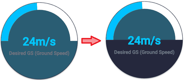
Display previous bar: If enabled, the bar stays colored at the position of the previously set value while the bar is moving to set the new value. Default is enabled.
Color: Color of the previous bar.
An example is given below:
Knob configuration - Display previous bar option enabled
Track: This parameter refers to the bar between the minimum and maximum values defined above, which is always below the bar that indicates the desired value.
Track cap: This parameter allows users to choose whether they want the ends of the track bar to be right angles or rounded.
\(\Rightarrow\) 100% rounded = 50% of the track width parameter.
Track width: The user can modify the width of the track bar as desired. By default it is set to 20.
Color: This is the color in which the track bar is drawn.
Background:
Color: Color of the knob widget background.
Full: If enabled, the entire knob widget is colored with the previously defined color. Otherwise, the knob will only be colored between the previously defined start and end angles. By default it is enabled.
In the following example, the start and end angles are set to -90 and 90 respectively.
Knob configuration - Full option enabled/disabled respectively
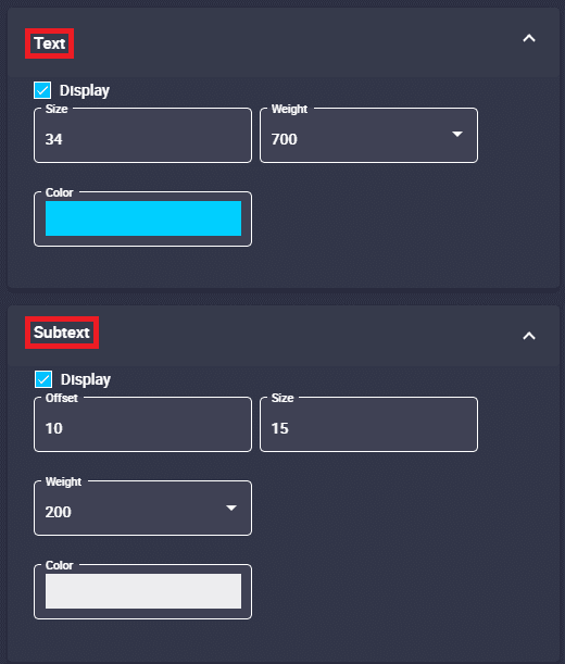
Text: This text refers to the value of the selected variable displayed in the knob.
Display: If enabled, displays on the knob the value of the selected variable. By default it is enabled.
Size: The size of the text value can be modified. Default is 32.
Weight: The weight of the text value can be modified. The available options go from 100 to 900, default is 700.
Color: Color in which the value is displayed.
Subtext: This subtext refers to the name of the selected variable displayed in the knob.
Display: If enabled, displays on the knob the name of the selected variable. By default it is enabled.
Offset: Vertical position of the selected variable name can be adjusted as desired. Default is 7.
Size: The size of the selected variable name can be changed. By default it is set to 14.
Weight: The weight of the selected variable name can be changed. The available options go from 100 to 900, default is 700.
Color: Color in which the selected variable name is displayed.
An example is given below:
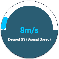
Knob example
The configuration for this example is as follows:
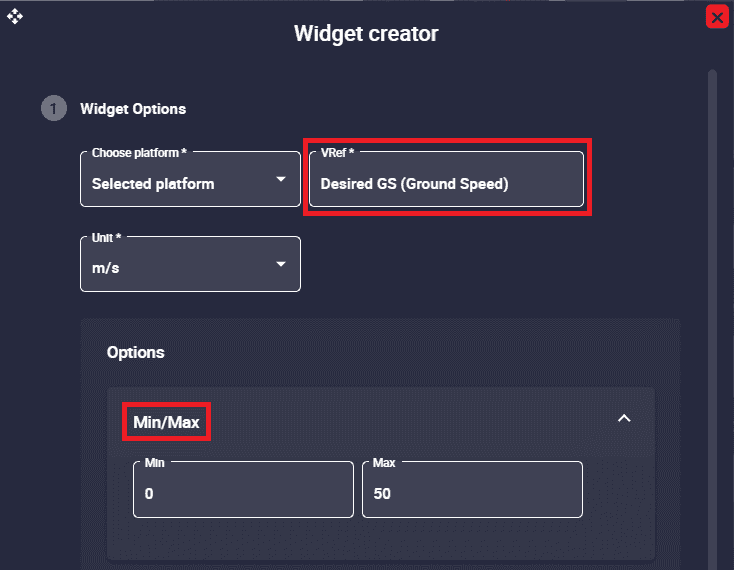
Knob configuration example - Variable and Min/Max option
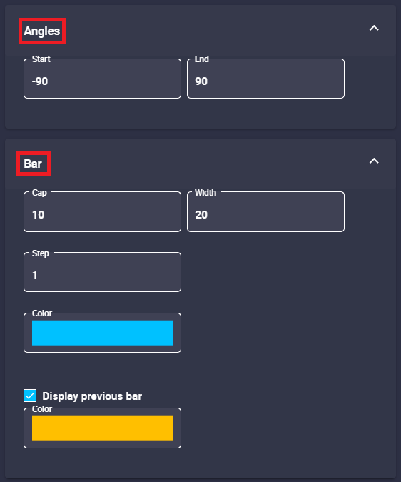
Knob configuration example - Angles and Bar options
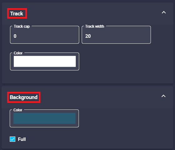
Knob configuration example - Track and Background options
Knob configuration example - Text and Subtext options