Statics
Statics widgets do not depend on the selected platform, therefore the ‘Choose platform’ parameter will not appear in any of the widgets described below.
Text
Text widget allows the user to insert text labels in the workspace.

Text
Right click on the text to access its options (Duplicate, Edit and Remove).
Options \(\rightarrow\) Edit: This allows the user to access the Text configuration menu.
Widget Options:
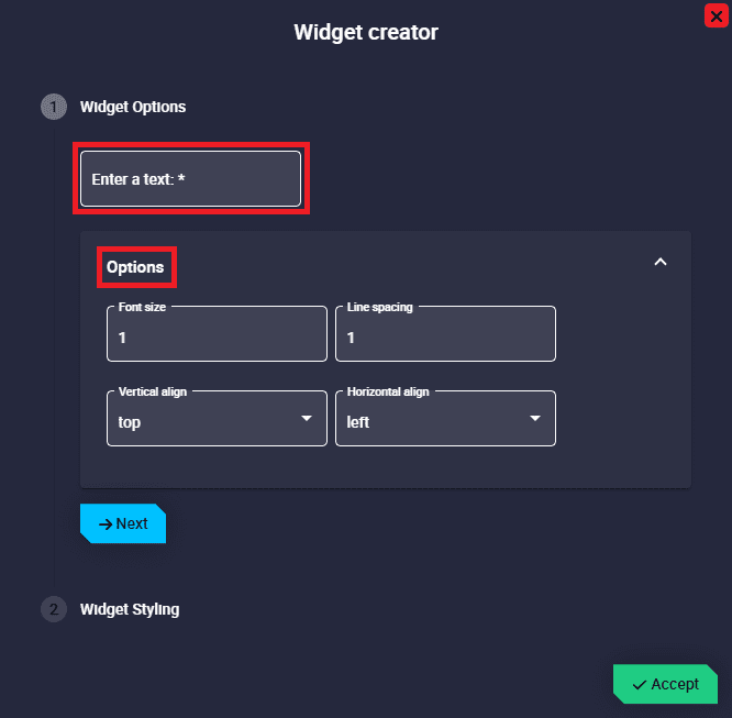
Text configuration
Enter a text: Enter the desired text to be displayed as a label.
Options: The following options allow the user to customize the Text widget as desired:
Font size: The text size can be adjusted by the user. The value must be \(\geq 1\).
Line spacing: When the text in the widget becomes a paragraph, this is the space between each line of that paragraph. The value must be \(\geq 1\).
Vertical align: Text can be vertically aligned. The available options are center, bottom and top.
Horizontal align: Text can be aligned horizontally. The available options are center, justify, left and right. The justify option only makes sense when the text is a paragraph.
Widget Styling: This widget has the ‘basic’ Widget Styling configuration described in the Widget common configuration.
Image
Image widget allows the user to insert an image in the workspace.
Note
A gif can also be added with this widget.

Image
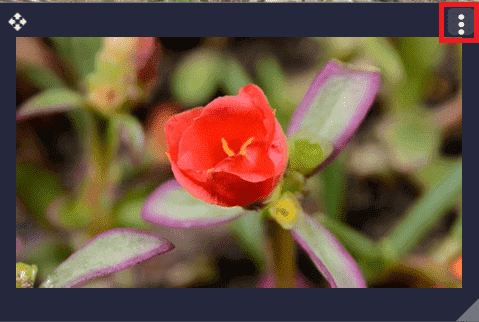
Right click on the image to access its options (Duplicate, Edit and Remove).
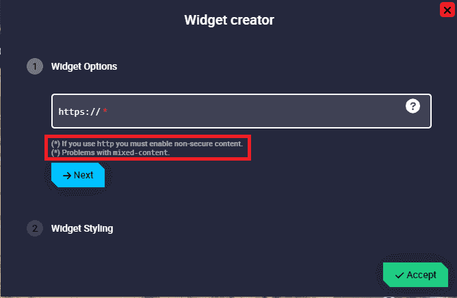
Options \(\rightarrow\) Edit: This allows the user to access the Image configuration menu.
Widget Options:
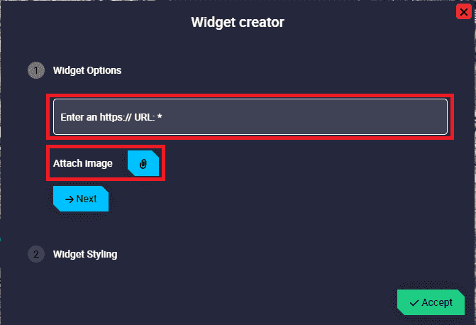
Image configuration
Enter an https:// URL: Users can enter the URL of the image to be displayed.
Attach Image: It is possible to import an image from PC.
Widget Styling: This widget has the ‘basic’ Widget Styling configuration described in the Widget common configuration.
An example is given below:
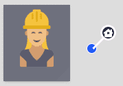
Image example
As can be seen in the figure below, this image has been imported from the browse.
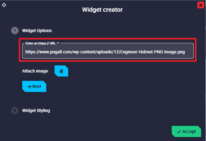
Image configuration - Widget Options example
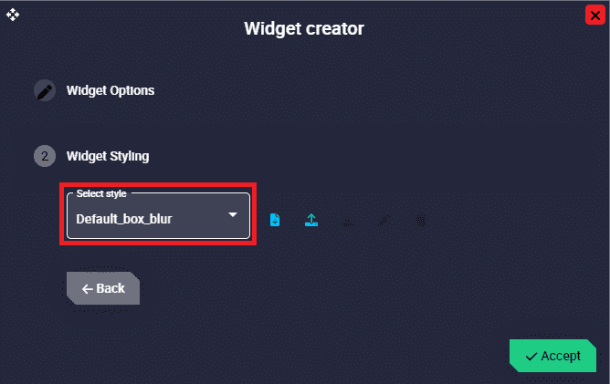
Image configuration - Widget Styling example
Iframe
Iframe widget allows the user to embed a web page as a widget in the workspace, as well as to visualize video from a gimbal camera.
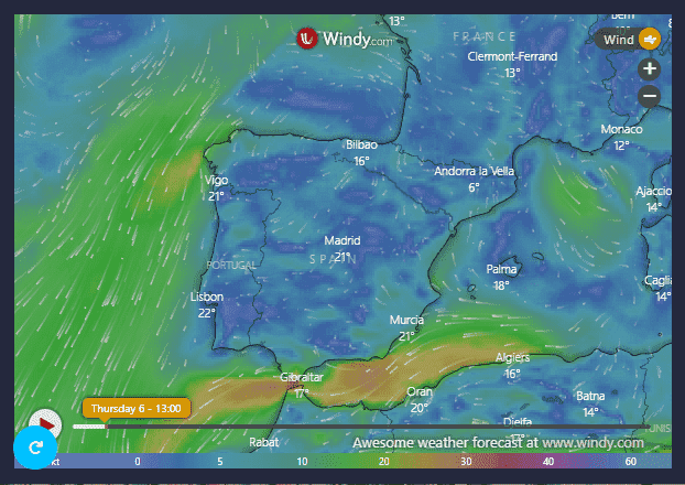
For example, useful websites could be: the windy website, the veronte operations manuals, the web application of the external radio if it is being used for operation, etc.
Iframe
Reload page: Refreshes the web page embedded as a widget.
Move: Allows the user to move the widget to the desired position in the workspace.
Options:
Duplicate: Duplicates this widget.
Edit: This allows the user to access the Iframe configuration menu.
Widget Options:
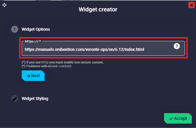
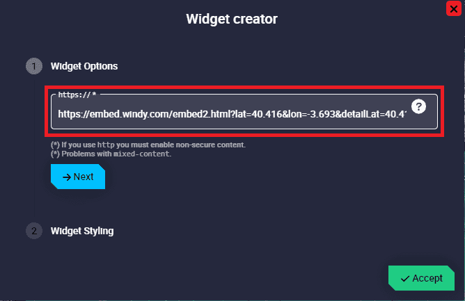
Iframe configuration
https:// : Users can enter the URL of the web page to be displayed.
In order to be able to view the video recording from a gimbal and also tracking directly with the image, users must copy here the URL generated by the Web Converter, which converts from RTSP to WebRTC.
Warning
Please take into account the notes in the widget.
Widget Styling: This widget has the ‘basic’ Widget Styling configuration described in the Widget common configuration.
Remove: Deletes this widget.
Some examples example are given below:
Video
Video widget allows the user to insert a video in the workspace.
Video
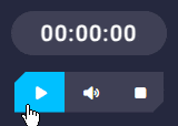
Click the  button to access its options (Duplicate, Edit and Remove).
Options \(\rightarrow\) Edit: This allows the user to access the Video configuration menu.
Widget Options:
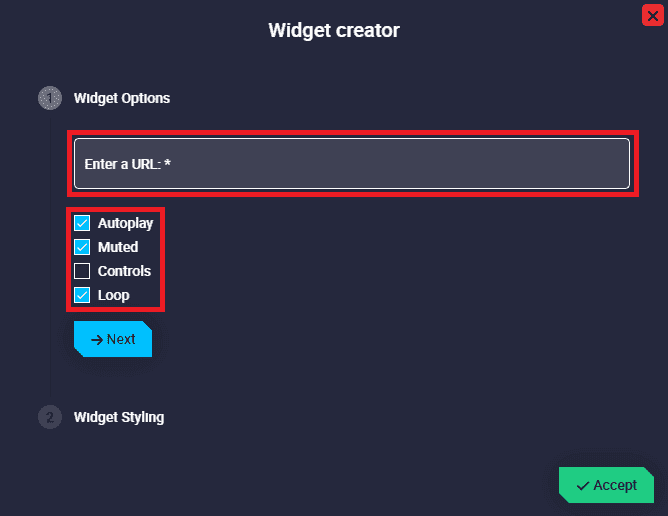
Video configuration
Enter a URL: Users can enter the URL of the video to be displayed.
Caution
The video must be in
.mp4,.ogg,.webmor.aviformat.Autoplay: The video plays automatically when the user enters its URL. By default it is enabled.
Muted: The video can be muted/unmuted. By default it is enabled.
Controls: Video controls can be added to the widget. Controls such as play/pause, mute/unmute, full screen, etc. By default it is disabled.
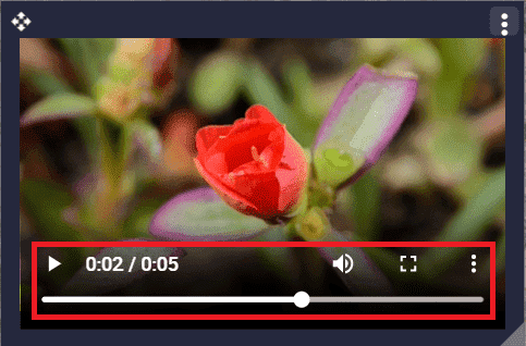
Video configuration - Controls
Loop: Video plays continuously, like a gif. By default it is enabled.
Widget Styling: This widget has the ‘basic’ Widget Styling configuration described in the Widget common configuration.
An example is given below:
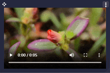
Video example
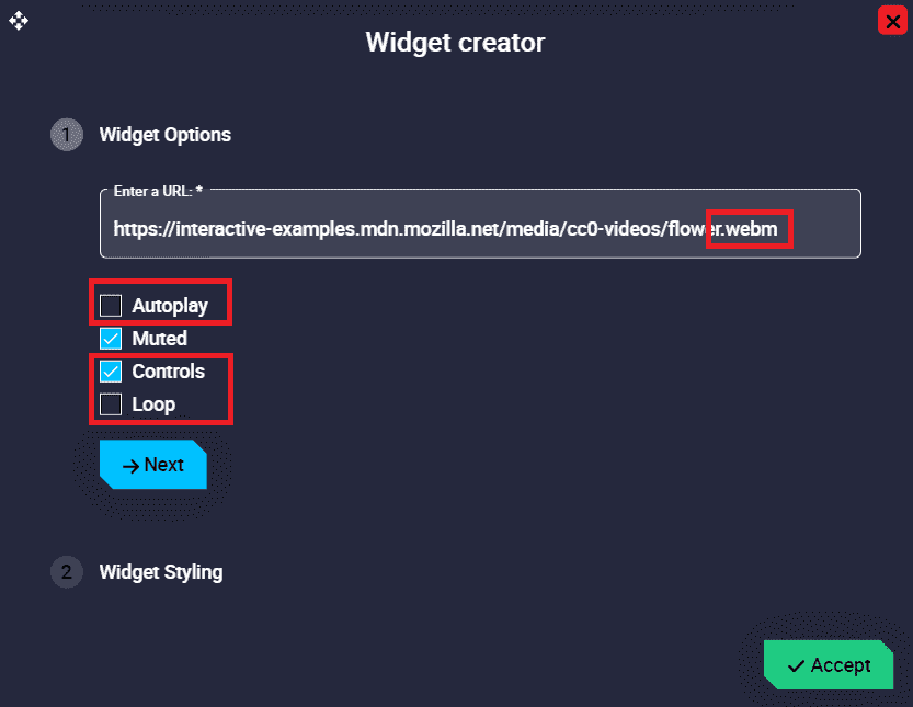
Video configuration example
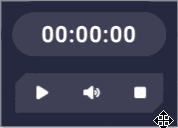
Timer
This widget is a counter, which can also function as a countdown counter if configured as such.
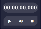
Timer
Right click on the widget to access its options (Duplicate, Edit and Remove).
Options \(\rightarrow\) Edit: This allows the user to access the Timer configuration menu.
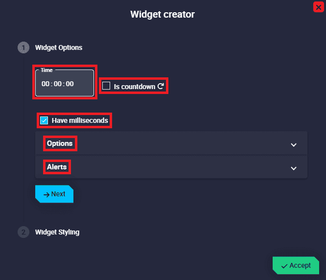
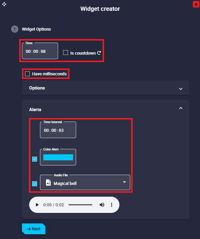
Timer configuration
Widget Options
This widget has different edit parameters compared to the ones described in the Widget common configuration.
Time: Users must enter the desired counter time. Note that if the Is countdown checkbox is enabled, this becomes the countdown time.
Is countdown: Enabling this option turns the widget into a countdown timer. Default is disabled.
Have milliseconds: If enabled, the time will be displayed with milliseconds. By default it is enabled.
Options: Users can set a warning time, color and sound for when the timer reaches the end of the set counter/countdown time.
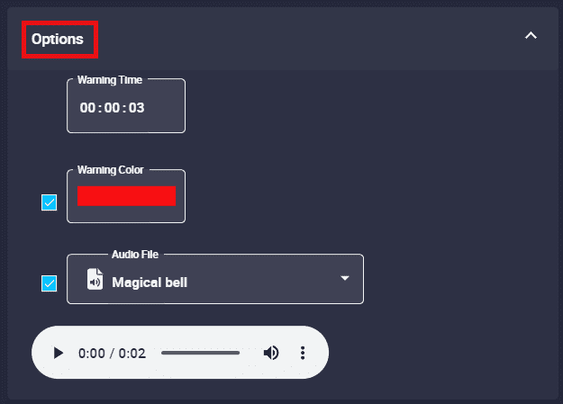
Timer configuration - Options
Warning Time: Time for the color and/or sound to be displayed until the end of the counter/countdown time.
Warning Color: If enabled, this color shall be displayed flashing continuously from the time the warning time is reached until the end of the counter/countdown.
Audio File: If enabled, the audio that users have selected from the audio list will play when the warning time is reached, sounding continuously until the end of the counter/countdown.
For example, if the audio file has a duration of 2 seconds and the warning time is set to 3 seconds, the audio will start playing for the first time from 3 seconds left until 1 second left and then play for the second time from 1 second left until the end. In other words, the audio will sound 1.5 times.
Important
If Warning Color and Audio File parameters are disabled, the warnings will be disabled.
For example, if the timer is configured as a countdown with a time of 8 seconds and the warning time is set to 3 seconds, the widget will be displayed with the color and/or sound defined here each of those final 3 seconds, i.e. from 3 to 0 seconds:
Timer - Countdown example
Alerts: Light and/or sound alerts can be activated every certain specified time.
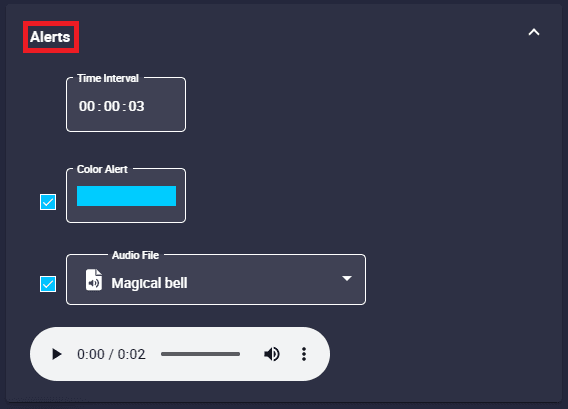
Timer configuration - Alerts
Time Interval: The time interval for the light and sound alerts is set here.
Color Alert: If enabled, the timer will have a light alert with the color specified here when the time interval elapses.
Audio file: If enabled, the timer will have an audible alert with the audio specified here when the time interval elapses.
Users can select the audio of the alert from the audio list.
Important
If Color Alert and Audio File parameters are disabled, the alerts will be disabled.
An example is given below:
Timer - Alert example
Timer - Alert example