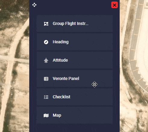
Main
Map
This widget corresponds to the map and only appears in this menu when the map has been hidden by the user.
Veronte Panel
This pannel is the basic operator tool. It includes all basic commands (phase and action buttons) and information needed during a standard mission. These commands can be triggered with a single click, by sliding and/or automatically.
-
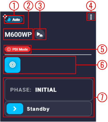
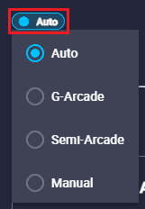
Flight mode: Displays the currently selected flight mode in which the user is operating.
By clicking on it, it is possible to manually change the selected mode. The flight modes available here must be previously defined in the Modes - Control section of the 1x PDI Builder software.
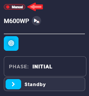
Veronte Panel - Flight modes When in manual mode, the lettering of the icon will be red, to warn the operator to be careful in this mode.
Veronte Panel - Manual flight mode Besides, the mode can also be changed automatically with an automation or manually with a configured stick.
-
Platform name: The name of the selected platform is shown here.
-
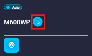
FastLog: By pressing this button, the Veronte Autopilot 1x will start recording the fastlog and this option will be as shown in the figure below:
Veronte Panel - FastLog recording To stop fastlog recording, simply click this button again.
For more information on Fast Log, see the Fast Log - Telemetry section of the 1x PDI Builder user manual.
Important
This button only appears when Fast Log has been configured in the 1x PDI Builder software.
-
Options: By clicking here, the following options are available:
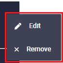
Veronte Panel options -
Edit: This allows the user to access the Veronte panel configuration menu.
This widget has two extra edit parameter compared to the ones described in Widgets common configuration:
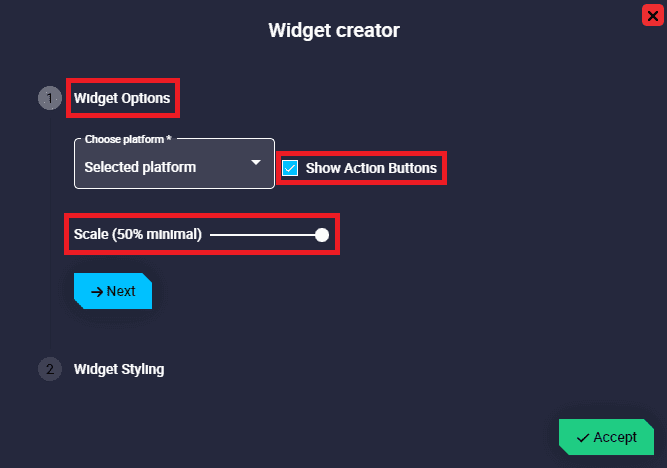
Veronte Panel configuration - Widget Options
- Show Action Buttons: When enabled, all the Action buttons are displayed in the Veronte panel.
- Scale (50% minimal): Veronte panel widget can be scaled from 50% to 100% of its size. By default it is set to 100%.
- Widget Options
-
Remove: Deletes this widget.
-
-
PDI Mode: This only appers if PDI Mode is configured in the 1x PDI Builder software.
For more information on PDI Mode, check the PDI Mode description of the 1x PDI Builder user manual.
-
Action buttons: Action buttons can be used to manually trigger certain actions. They must have been previously defined in the Automations menu of the 1x PDI Builder software.
Note
For further details about Action buttons, refer to Action Button - Inputs section of the present manual.
-
Phase buttons: The currently selected phase is always displayed at the top in the current phase identifier.
Important
Not all existing flight phases are initially displayed. Only flight phases that can be entered from the currently selected phase are displayed.
To change phase, simply slide the
 icon to the right.
Then, if everything is correct, the phase will be displayed in the current phase indentifier and will be colored green while switching to that phase. An example is shown below:
icon to the right.
Then, if everything is correct, the phase will be displayed in the current phase indentifier and will be colored green while switching to that phase. An example is shown below: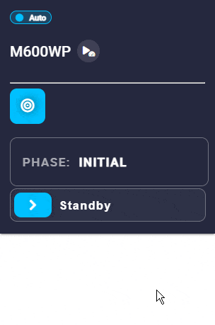
Veronte Panel - Changing phase Warning
An error may occur when changing phase, so that the phase change does not take place. To solve this problem, please check the Error when changing phase - Troubleshooting section of this manual.
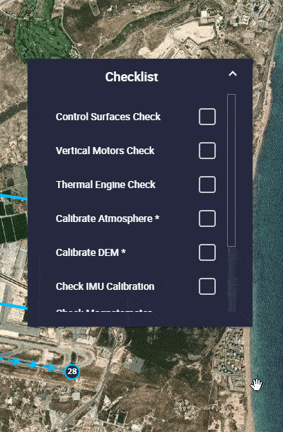
Checklist
This panel is used to make sure that some requirements have been accomplished, for example, prior to a phase change or to avoid a possible malfunction.
It must be previously defined in the Checklist - Safety section of the 1x PDI Builder software.
-
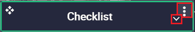
Options:
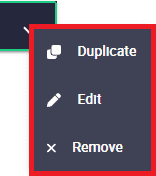
Checklist options - Duplicate: Duplicates this widget.
-
Edit: This allows the user to access the Checklist configuration menu. This widget has only the 'basic' configuration described in the Widgets common configuration.
-
Remove: Deletes this widget.
As this widget behaves like a drop-down menu, clicking on the  icon will display all checklists:
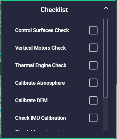
Besides, as can be seen in the figures above, the checklist widget has a small green border. This indicates that everything is OK to start the operation, even though there is no 'check' in the list.
This is because none of these checks are mandatory to switch phases or start the operation. The mandatory checks are marked with an asterisk (*) on the right, as shown in the image below.
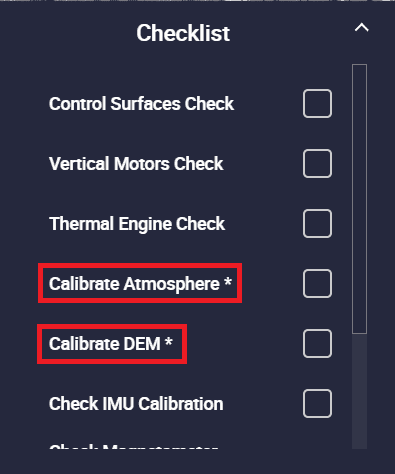
In this case, the widget has no green border until these mandatory actions are performed:
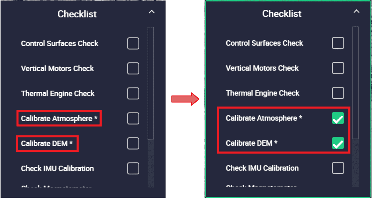
To do so, checking them opens a menu that allows the user to perform these actions, in this case, some calibrations. An example is shown below:
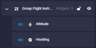
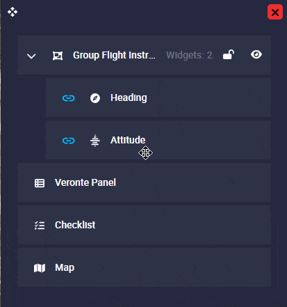
Group
Veronte Ops allows users to create groups of widgets, where they can group as many widgets as they wish. This is useful for linking widgets and moving them together. In addition, it is possible to create a condition to choose when the group is shown.
Moreover, it is also common to create groups containing a single widget when using a condition for the group.
Important
This widget is managed from the sorting panel.
Once the group is created, go to the sorting panel and right click on the group to access its options:
- Remove: Removes the group and also the widgets in the group.
-
Edit: This allows the user to access the Group configuration menu.
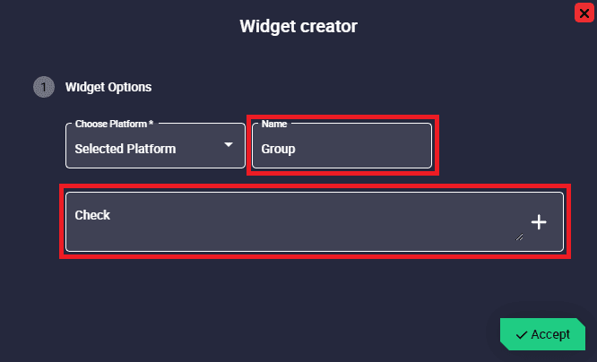
Group configuration -
Widget Options
This widget has two extra edit parameters compared to the ones described in Widgets common configuration.
- Name: For easy identification of each group, users can enter a custom name for each one.
-
Check: Here users can set the conditions they want for a group to be displayed or not.
These conditions must be set according to the values of the system variables.
Note
It is not mandatory to have a condition for a group.
Warning
For these conditions to apply correctly, widgets must be locked from the Workspace toolbar. Otherwise, these conditions will have no effect.
Follow the next steps to correctly define a condition:
-
Click on the
 icon and select the desired variable from the list to established the condition:
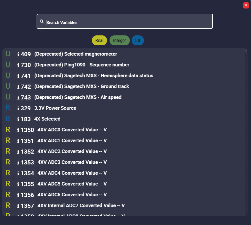
Group configuration - Variables to create a condition -
Build the condition with logical operators. The following is a list of logical operators that can be used by the user:
Condition Operator Description Equality == For more information click here Inequality != For more information click here Greater than > For more information click here Greater than or equal >= For more information click here Less than < For more information click here Less than or equal <= For more information click here Logical AND && For more information click here Logical NOT ! For more information click here Logical OR || For more information click here Grouping operator () For more information click here -
Press the Accept button to create the group with this condition.
-
-
After configuring it, return to the sorting panel where users can add widgets to the created group, link/unlink, show/hide, lock/unlock, move and remove the added widgets, as well as access the Group widget configuration menu (as described above).
The following are the actions to be performed in the sorting panel in order to manage the widgets within the group:
-
To add a widget to a group, simply select it and drag it into the Group widget:
Adding widgets to a group -
To remove a widget from a group, select it and drag it out of the Group widget:
Removing widgets from a group -
Linking widgets. By default, widgets are linked and appear with a
 icon next to them in the group.
Therefore, if users move one of the widgets in the group, the rest of the linked ones will move together.
To unlink them, click on the icon on the widgets to be unlinked, then they will appear as unlinked (
icon next to them in the group.
Therefore, if users move one of the widgets in the group, the rest of the linked ones will move together.
To unlink them, click on the icon on the widgets to be unlinked, then they will appear as unlinked ( ).
Thus, if one is not marked, it may move with respect to the other elements in the group.
).
Thus, if one is not marked, it may move with respect to the other elements in the group. -
Show/Hide groups. By default, all groups are shown in the workspace (they appear as
 ).
Nonetheless, by clicking on they can be hidden.
).
Nonetheless, by clicking on they can be hidden.To show them again, simply click on
 .
.Hint
If users want to show different groups at different "moments" of the flight, it may be useful to hide them during creation. In this way, groups can be placed in the same place and thus "save" space in the workspace.
-
Lock/Unlock groups. When groups are locked, users will not be able to move them in the workspace. By default, all groups are unlocked (
 ).
).To lock them, simply click on
and they will appear as  .
In addition, when a group is locked, users cannot add, remove, link or unlink the widgets that belong to it.
.
In addition, when a group is locked, users cannot add, remove, link or unlink the widgets that belong to it.
Example of a Group widget with condition
If users only want to have a pre-flight Checklist widget before starting the flight (i.e. only in the initial phase):
-
For only displaying this group in the initial phase, build the following condition in the Group widget configuration:
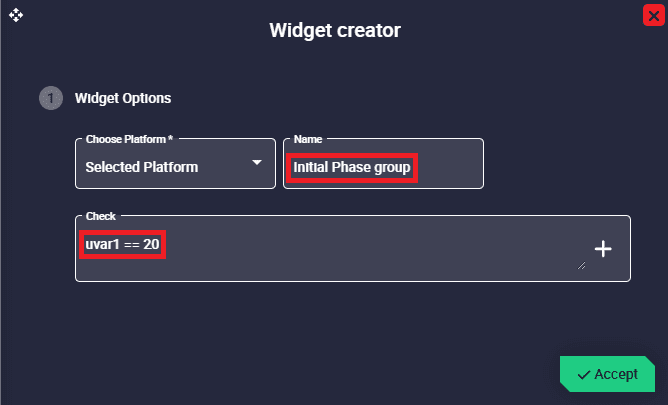
Configuration of group with condition Where:
- uvar1 is the Phase identifier variable
- is the equality operator
- 20 is the ID of the initial phase
-
Add the desired Checklist widget to the group just created
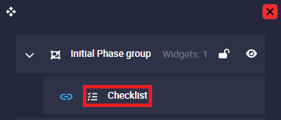
Group with condition
Therefore, this implies that: Only when the flight phase is the one with ID 20 (initial phase), widgets added to this group, in this case the Checklist widget, will be displayed.
© 2025 Embention. All rights reserved.